Checkboxes alignment
- Subscribe to RSS Feed
- Mark Topic as New
- Mark Topic as Read
- Float this Topic for Current User
- Bookmark
- Subscribe
- Printer Friendly Page
- Mark as New
- Bookmark
- Subscribe
- Mute
- Subscribe to RSS Feed
- Permalink
- Report Inappropriate Content
Hi,
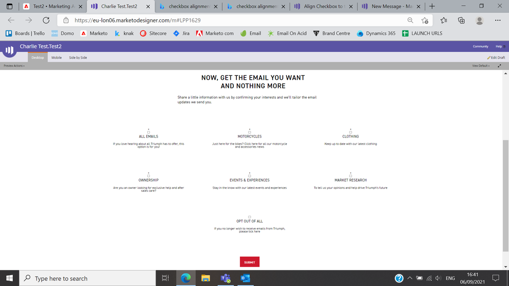
I'm trying to do a couple of things and wonder if anyone could give some advice. Firstly, I've got a form and I'm using the 'Checkboxes' option for a field. I want to align the checkbox ABOVE the field label. Is this possible? I'm floating fields to the left to create multiple columns, so whenever I try to float above it messes this setting up!
I also need to put a line break in the text of the field label. Is this possible at all?
So currently my form looks like this : go.triumphmotorcycles.com/Preference-Centre-2021-Eng.html
And I want it to look like the below image
Thanks!
Charlie
Solved! Go to Solution.
- Mark as New
- Bookmark
- Subscribe
- Mute
- Subscribe to RSS Feed
- Permalink
- Report Inappropriate Content
... if you are able to break up the checkbox field (singular field w/ multiple values) into individual fields (multiple fields w/ singular values)
Changing the data model is a huge modification, though. The ability of the Checkboxes form type to concat values in a single String/Text type field on the back end, with different values offered on different forms, is one of its powers.
If you want those wrappers around the individual input-label combos for styling, do this:
(function(){
  const individuallyWrapCheckboxes = ["contactContentPreference"];

  /* -- NO NEED TO TOUCH BELOW THIS LINE! -- */

  const arrayify = getSelection.call.bind([].slice);

  MktoForms2.whenRendered(function(mktoForm){
    let formEl = mktoForm.getFormElem()[0],
        wrappableCheckboxes = formEl.querySelectorAll("input[type='checkbox']:not([data-wrappers-readystate])");

     arrayify(wrappableCheckboxes)
     .filter(function(input){
        if( individuallyWrapCheckboxes.indexOf(input.name) != -1 ) {
          input.setAttribute("data-wrappers-readystate","added")
          return true;
        } else {
          input.setAttribute("data-wrappers-readystate","ignored")
          return false;
        }
     })
     .map(function(input){
        return {
           input : input,
           label : formEl.querySelector("label[for='" + input.id + "']")
        };
      })
      .forEach(function(combo){
         let wrapper = document.createElement("div");

         wrapper.classList.add("mktoCheckboxWrapper");
         combo.input.parentNode.replaceChild(wrapper, combo.input);
         wrapper.appendChild(combo.input);
         wrapper.appendChild(combo.label);
      });
  });
})();
- Mark as New
- Bookmark
- Subscribe
- Mute
- Subscribe to RSS Feed
- Permalink
- Report Inappropriate Content
Hi Charlie,
To make this layout, we have to use both jquery and CSS. Firstly, add this jquery to your form then CSS
$('.mktoLogicalField input').each(function() {
$(this).next('label').andSelf().wrapAll('<div class="checkboxes"/>'); });
CSS:
.mktoLogicalField.mktoCheckboxList {
width: 100% !important;
display: flex; padding: 0px !important; flex-wrap: wrap;
}
.checkboxes { width: 33.3% !important;
padding: 20px !important;
box-sizing: border-box;
margin: 0 auto 20px !important;
}
.mktoCheckboxList .checkboxes .mktoField {
float: none !important;
margin: 0 auto 20px !important;
display: block !important;
clear: both !important;
}
.mktoCheckboxList .checkboxes label {
width: 100% !important;
min-width: 100% !important;
max-width: 100% !important;
margin: 0 auto !important;
display: block !important;
line-height:24px;
}
@media only screen and (max-width: 700px){
.checkboxes {
width: 50% !important;
}
}
@media only screen and (max-width: 500px){
.checkboxes {
width: 100% !important;
}
}
Let me know if this solves your query.
Thanks,
Monali
- Mark as New
- Bookmark
- Subscribe
- Mute
- Subscribe to RSS Feed
- Permalink
- Report Inappropriate Content
Hey Charlie,
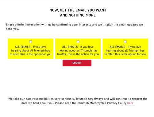
I was able to get something working in the inspector but I needed to edit the setup of the fields just a bit to get it to work. I can't think of a way to get this into columns AND re-orient the layout of the input/label without having some kind of parent element to wrap the input/label combos (floats will only get you to thru the first hurdle here).
Rather than having all the checkbox/label pairs be a single input, I removed all but one of the input/label combos and copy/pasted the form column a few times for the sake of example. I don't know if this'll work in your situation, but if you are able to break up the checkbox field (singular field w/ multiple values) into individual fields (multiple fields w/ singular values), it'll be much easier to work with the layout b/c you'll have a little extra structural html in play (form columns) to work with.
In this example, each checkboxes field (still use the checkboxes field type, even for one input) would have a singular value, so basically take each of the input/label sets you've got in the one field and make a new field for each set. In the form editor, you can drag-n-drop those fields into 3-columns to create the column layout for the form (the CSS below should do the rest).
The trick here is to isolate each checkbox parent element (the checkbox list) and use display: flex to change the orientation of the child elements from "across" to "stacked" to get the inputs up above the labels. The same goes for the rows and columns, the rows are display "stacked" for mobile (flex-direction: column) and "across" for tablet and up (flex-direction: row).
Here's a look at what I'm seeing when I add in the attached CSS into the browser console:


/* display content in a row stacked (for mobile) */
.mktoFormRow { display:flex; flex-direction: column;}
/* flex-grow helps the columns maintain a consistent size */
.mktoFormCol {flex-grow:1; display:flex;}
/* checkbox parent element */
.mktoForm .mktoLogicalField {
    width:100% !important;
    background:yellow; /* EXAMPLE ONLY - remove for production */
    padding:0px;
    margin:0px !important;
    display:flex;
    flex-direction:column;
}
/* fluid width field wrap (override fixed inline width) */
.mktoFieldWrap {width: 100% !important;}
/* fields inside a checkbox list (checkbox fields) */
.mktoCheckboxList .mktoField {
    margin:10px auto !important;
}
/* labels inside a checkbox list (checkbox labels) */
.mktoCheckboxList label {
    max-width:100% !important;
    width:100% !important;
    margin:0px !important;
    padding:0 10px 15px 10px;
}
/* for tablet and up, display form columns in rows across rather than stacked */
@media screen and (min-width:768px) {
    .mktoFormRow {flex-direction: row;}
}*NOTE: This CSS will only work if the input/label pairs are setup as individual checkboxes fields rather than one aggregated field.
I've added some comments to the CSS here, but let me know if you've got any questions about what any of this is doing. I left the "yellow" background color in there for the sake of example, but that line can be changed/removed for production.
Using this pattern, you can place 3 checkboxes fields in a row in the form editor and just repeat row-over-row to create the rest.
For the line-breaks in the label text, you should be able to set that under the "Values" link in the form editor where you set the "Display Value" for the checkboxes field. Once you click the "Values" link, a dialog pops up that lets you edit the Display Value and Stored Value for the field. The Display Value will accept inline HTML, so you can probably just add a <br> tag where you'd like a line break in there. You should be able to add inline HTML to both the "actual label" of the field (at the very top right of the form editor when you click on a field) as well as the "Display Value" of checkboxes input, all the same.
- Mark as New
- Bookmark
- Subscribe
- Mute
- Subscribe to RSS Feed
- Permalink
- Report Inappropriate Content
... if you are able to break up the checkbox field (singular field w/ multiple values) into individual fields (multiple fields w/ singular values)
Changing the data model is a huge modification, though. The ability of the Checkboxes form type to concat values in a single String/Text type field on the back end, with different values offered on different forms, is one of its powers.
If you want those wrappers around the individual input-label combos for styling, do this:
(function(){
  const individuallyWrapCheckboxes = ["contactContentPreference"];

  /* -- NO NEED TO TOUCH BELOW THIS LINE! -- */

  const arrayify = getSelection.call.bind([].slice);

  MktoForms2.whenRendered(function(mktoForm){
    let formEl = mktoForm.getFormElem()[0],
        wrappableCheckboxes = formEl.querySelectorAll("input[type='checkbox']:not([data-wrappers-readystate])");

     arrayify(wrappableCheckboxes)
     .filter(function(input){
        if( individuallyWrapCheckboxes.indexOf(input.name) != -1 ) {
          input.setAttribute("data-wrappers-readystate","added")
          return true;
        } else {
          input.setAttribute("data-wrappers-readystate","ignored")
          return false;
        }
     })
     .map(function(input){
        return {
           input : input,
           label : formEl.querySelector("label[for='" + input.id + "']")
        };
      })
      .forEach(function(combo){
         let wrapper = document.createElement("div");

         wrapper.classList.add("mktoCheckboxWrapper");
         combo.input.parentNode.replaceChild(wrapper, combo.input);
         wrapper.appendChild(combo.input);
         wrapper.appendChild(combo.label);
      });
  });
})();
- Mark as New
- Bookmark
- Subscribe
- Mute
- Subscribe to RSS Feed
- Permalink
- Report Inappropriate Content
This has worked perfectly, thank you so much! The only issue I'm having now is aligning the checkbox in the centre of the field. Would you have any idea on how to set this?
Thank you again
Charlie
- Mark as New
- Bookmark
- Subscribe
- Mute
- Subscribe to RSS Feed
- Permalink
- Report Inappropriate Content
Instead of relying on the labels for the Checkboxes field, you can erase the label and then put a text area below it. With a combination of those, you should be able to recreate what you want.
- Mark as New
- Bookmark
- Subscribe
- Mute
- Subscribe to RSS Feed
- Permalink
- Report Inappropriate Content
This solves the problem aesthetically but it breaks the pairing of the input/label relationship and would fail accessibility testing b/c there'd be no relationship between the text (faux-label) and the input "as the computer reads it".
- Copyright © 2025 Adobe. All rights reserved.
- Privacy
- Community Guidelines
- Terms of use
- Do not sell my personal information
Adchoices
