Change the display location for image and text for the email template on mobile
- Subscribe to RSS Feed
- Mark Topic as New
- Mark Topic as Read
- Float this Topic for Current User
- Bookmark
- Subscribe
- Printer Friendly Page
- Mark as New
- Bookmark
- Subscribe
- Mute
- Subscribe to RSS Feed
- Permalink
- Report Inappropriate Content
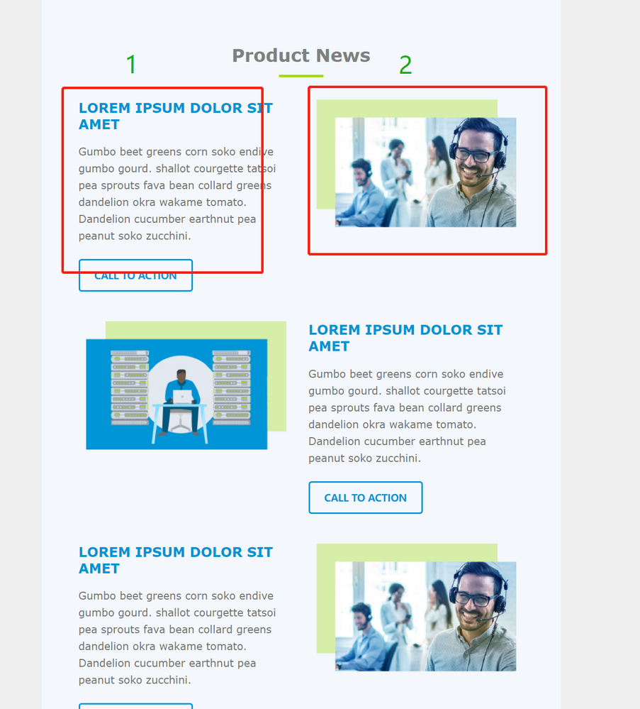
We design a template for email: " Right-image and Left text", and "Right-text and Left-image". For the template "Right-image and Left text" which has an issue on Mobile. We want to display the right-image above the left-text on Mobile. How can we achieve it?
Solved! Go to Solution.
- Mark as New
- Bookmark
- Subscribe
- Mute
- Subscribe to RSS Feed
- Permalink
- Report Inappropriate Content
@Eve_Yu , in the absence of any code, we can't provide a fully worked solution. However, here is a generic solution that'll work.
Put this in your CSS
      @media screen and (max-width:600px) {
        .top {
          display: table-header-group !important;
          width: 100% !important;
        }
        .bottom {
          display: table-footer-group !important;
          width: 100% !important;
        }
      }
And this in your module
<table border="0" cellpadding="0" cellspacing="0" role="presentation" style="width:100%;">
  <tr>
    <td class="bottom" style="width:50%;">
      <table border="0" cellpadding="0" cellspacing="0" role="presentation">
        <tr>
          <td>
            <p>Put your content here</p>
          </td>
        </tr>
      </table>
    </td>
    <td align="left" class="top" style="width:50%">
      <table cellpadding="0" cellspacing="0" role="presentation" width="100%">
        <tr>
          <td align="center">
            <img alt="" src="https://yourimagegoeshere.com/image.png>
          </td>
        </tr>
      </table>
    </td>
  </tr>
</table>
That should work hunky dunky. It relies on using header and footer groups which have ordering intrinsic to them.
Regards
Jo
- Mark as New
- Bookmark
- Subscribe
- Mute
- Subscribe to RSS Feed
- Permalink
- Report Inappropriate Content
@Jo_Pitts1 Thanks for your help. It works.
- Mark as New
- Bookmark
- Subscribe
- Mute
- Subscribe to RSS Feed
- Permalink
- Report Inappropriate Content
- Mark as New
- Bookmark
- Subscribe
- Mute
- Subscribe to RSS Feed
- Permalink
- Report Inappropriate Content
Hi @Eve_Yu
Yes, we can do this by using the direction property in the columns.
Please share the coding or layout so that I can let you know how & where you can use the direction property.
Thanks!
Jasbir
- Mark as New
- Bookmark
- Subscribe
- Mute
- Subscribe to RSS Feed
- Permalink
- Report Inappropriate Content
We used this code
@media only screen and (min-width: 480px){
.hide-pc {
display:none !important;
overflow:hidden;

mso-hide:all;
margin:0;
font-size:0;
max-height:0;
}
}
@media only screen and (max-width: 479px){
.hide-mobile {
display:none !important;
overflow:hidden;
mso-hide:all;
margin:0;
font-size:0;
max-height:0;
}
}
And this is our layout, we want to display the image 2 above the text 1 on mobile.
- Mark as New
- Bookmark
- Subscribe
- Mute
- Subscribe to RSS Feed
- Permalink
- Report Inappropriate Content
@Eve_Yu ,
I have given you an example that works. Look at it.
- Mark as New
- Bookmark
- Subscribe
- Mute
- Subscribe to RSS Feed
- Permalink
- Report Inappropriate Content
Thanks for your reply. We will have a try.
- Copyright © 2025 Adobe. All rights reserved.
- Privacy
- Community Guidelines
- Terms of use
- Do not sell my personal information
Adchoices
