Re: Can I make a Rich Text field required in Forms?
- Subscribe to RSS Feed
- Mark Topic as New
- Mark Topic as Read
- Float this Topic for Current User
- Bookmark
- Subscribe
- Printer Friendly Page
- Mark as New
- Bookmark
- Subscribe
- Mute
- Subscribe to RSS Feed
- Permalink
- Report Inappropriate Content
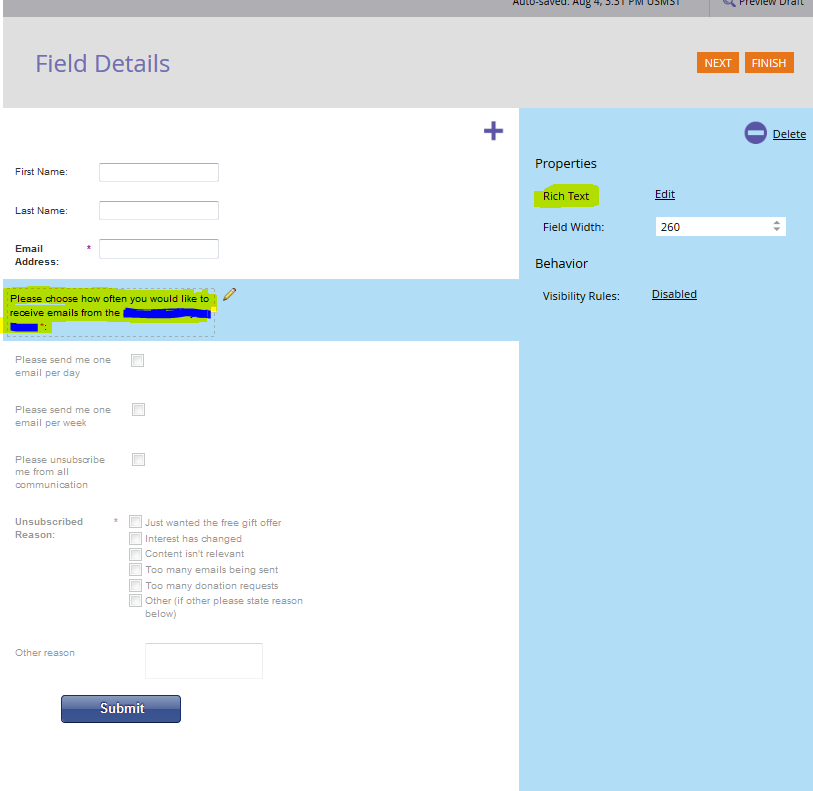
Hello, this may sound like a silly question, but is there a way to make the rich text field in a form required? I set up a subscription center and would like to make sure that the lead checks at least one the fields below the rich text field before they click Submit. I don't believe I can make every checkbox field required as that would be contradictory, but I do want to be sure that someone chooses ONE of the boxes before moving ahead. Right now, each checkbox field, except for the Unsubscribed Reason field, is an individual field and not part of a picklist. BTW, the little red asterisk at the end of the field is one that I added, to make them think it is required before moving forward.
Thank you,
Laura
- Labels:
-
Email Marketing
-
Lead Management
- Mark as New
- Bookmark
- Subscribe
- Mute
- Subscribe to RSS Feed
- Permalink
- Report Inappropriate Content
I must disagree with the others' recommendations of a picklist/dropdown/<SELECT> tag. The most appropriate widget here is a radio button set: it carries the well-known meaning of "choose one, but only one" and all the choices are visually apparent. Dropdowns should be a last resort -- which is not to say I don't use them a lot, just that I try to think of alternatives.
But I do agree that there's no apparent reason for the three checkboxes to be different fields as they are clearly mutually exclusive. It was a mistake to set them up this way (sorry!).
If you can't combine the checkboxes into a single field but still want to pretend they're a set -- essentially forging a "virtual" radio set out of independent fields -- it's very easy with a tiny bit of Forms 2.0 JS: MktoForms2 :: Checkboxes to Virtual Radios
- Mark as New
- Bookmark
- Subscribe
- Mute
- Subscribe to RSS Feed
- Permalink
- Report Inappropriate Content
Hi Laura,
Not sure how you would achieve this without some custom javascript. Have you considered making this a select box as it is very unlikely someone would select more than one of these options at a given time?
If the concern is that you need to have the unsubscribe as a separate field, you can easily create a trigger that unsubscribes someone when they select that option from the dropdown.
Hope this helps.
Jason
- Mark as New
- Bookmark
- Subscribe
- Mute
- Subscribe to RSS Feed
- Permalink
- Report Inappropriate Content
Unfortunately, Laura, I don't think it is (short of some custom js put on the form page, which is far beyond my capabilities. ![]() )
)
What you can do, of course, is make that rich text instead an actual custom field/question in Marketo and then have each of those items as picklist values. That field could then be made required along with all the other functionality that fields enable. By making that field required, they have to pick one (and depending on the field style you choose, would be allowed to pick only one.)
(You could then use smart campaigns to automate that if they pick a value from your newly created question, it then updates the data value on those three individual fields re: email frequency. If removing those fields and leveraging a single one isn't an option.)
- Mark as New
- Bookmark
- Subscribe
- Mute
- Subscribe to RSS Feed
- Permalink
- Report Inappropriate Content
Totally on the same page at the same time Michaela![]()
- Copyright © 2025 Adobe. All rights reserved.
- Privacy
- Community Guidelines
- Terms of use
- Do not sell my personal information
Adchoices
