- Marketing Nation
- :
- Products
- :
- Blogs
- :
- Product Blogs
- :
Marketo Success Series: Landing Pages
- Subscribe to RSS Feed
- Mark as New
- Mark as Read
- Bookmark
- Subscribe
- Printer Friendly Page
- Report Inappropriate Content
- Mark as New
- Bookmark
- Subscribe
- Mute
- Subscribe to RSS Feed
- Permalink
- Report Inappropriate Content
Hello Marketing Nation,
Welcome back to the Marketo Success Series! In this series, we partner with Marketo Champions and Champion Alumni to fully explore how some of our most celebrated Marketo experts are using Marketo Engage to drive success. In this edition, we teamed up with Marketo Engage Champion Alex Greger and Champion Alumni Lauren Aquilino to talk about Landing Pages, why you should use them, the difference between Guided and Freeform, A/B testing, and more!
What are Landing Pages?
Landing Pages are Marketo-hosted pages that allow you to display content and track visitors. There are 101 opportunities I can think of to use landing pages:
- Webinar registrations
- Content downloads
- Party invitations
- Campaign microsites
- Pay per click campaigns
- Account-based marketing
- Direct mail efforts
- The list goes on.
But let’s get some technical considerations out of the way. First, your Marketo landing pages should have a CNAME that is a subdomain of your main domain (e.g. pages.yourdomain.com). You’ll need the help of your IT department with this, but when it’s done, it’s done. Second, consider whether you’ll need SSL (Secure Socket Layer) encryption for your landing pages. According to Marketo: “When you fill out a web form or visit a landing page that's hosted by Marketo, by default the information is sent over non-secure protocol (HTTP). Per your company’s policy, you may want to secure the information submitted to Marketo over (HTTPS). For example, when you visit http://info.mydomain.com/ it will now be https://info.mydomain.com/.” This will be especially important if you decide to use iFrames to place Marketo forms on your SSL encrypted website. Contact your CSM if this is a requirement for you.
Why Use Them
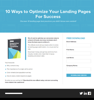
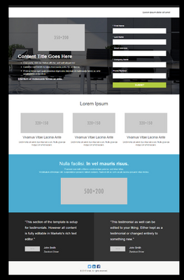
Using Marketo landing pages puts the power of page creation in marketers’ hands. With pre-built templates, it’s super-easy to edit text, pop in an image, and add a form without code. While landing pages often serve as a lead gen page, they can also be built into microsites or campaign hubs. This is helpful if you are running campaigns, but your web team doesn’t want to update the website for each circumstance.
How to Use Them
Landing pages typically live as assets within programs in Marketing Activities, while templates live within the Design Studio.
To start, you’ll want to make sure you have a good template to use. Next, you’ll want to use basic best-practices to build out your content.
- One call-to-action
- Too many choices hurt conversion rates due to the paradox of choice—a feeling of being overwhelmed due to too many options. This can cause indecision, dissatisfaction, and even unhappiness.
- Optimize lead capture with short forms
- The shorter the form, the more likely someone is to fill it out. However, you’ll still want to be sure to capture essential contact info for your purposes. This may include required fields in your CRM, or data needed for lead routing or proper segmentation.
- Personalize
- Personalization can make your customers and prospects feel pretty special. Use tokens and dynamic content to show the most relevant content possible.
- Ensure responsive design
- 42% of researchers use a mobile device during the B2B purchasing process(2) Responsive design means that your landing page will adjust to the environment based on things like screen size, device, and web browser. This allows for a lot of flexibility in the way the content is shown. Have you ever visited a site on your mobile device that was clearly not built for smaller screen sizes? It’s a terrible experience, and visitors are likely to drop if they can’t easily navigate your page on their device.
- Include social proof
- Social proof is the idea that people will follow the actions of others because they assume that if someone else has done it, it must be correct. Examples of what you can add to your landing pages might include customer quotes, tweets, and customer logos that instill confidence in your brand.
- Sense of urgency or scarcity
- The scarcity principle follows the notion that you will always want what you can’t have. (3) Instilling a sense of urgency (a countdown, for example) increases focus on finishing the task at hand—in this case, filling out a form.
Basic components of a landing page typically include:
- Header
- Body copy
- Images
- Forms
- Call to action
You’ll want to define and gather all of these requirements before building out a landing page using your chosen landing page template.
Guided vs. Free-form
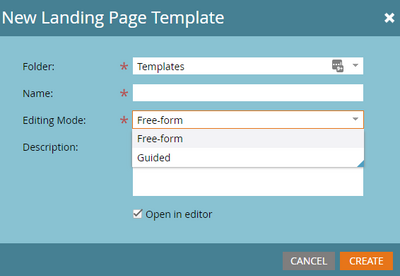
Marketo offers two types of landing page templates, Guided and Free-form. This is chosen when initially creating the template and determines the type of editing and flexibility you have with individual landing pages. This ensures developers or agencies understand the difference and pick the correct one as each has its own pros and cons.
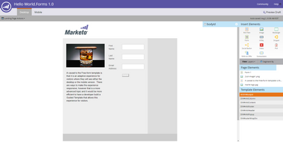
Free-form templates allow you to drag and drop different types of elements anywhere on the page while allowing predefined editable areas if designated in the template. This feels and acts similar to a slide deck where you place the elements, change the size and spacing, and how it looks in the editor is how it will render for the end visitor.
The Free-form template is best used when you need a one-off landing page and no time, budget, or resources at your disposal as is it allows the flexibility of creating a brand new landing page in a few minutes with little to no coding or development needs.
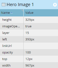
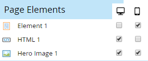
As you drag and drop these elements onto the canvas, a dropdown style sheet allows you to add different style elements, change the size, and align the element within the page. Then with a simple click to the mobile tab and activating the page, you will be able to re-align elements, shorten copy, and turn on/off extraneous items that are not necessary without affecting the desktop version.
A caveat to the Free-form template is that it is an adaptive experience for visitors where they will see either the desktop or the mobile version. There are ways to make the experience responsive, however, that is a more advanced topic and it would be more efficient to have a developer build a Guided template that allows this experience for visitors.
Guided templates are the latest version of the Marketo Landing Page product. It has some great updates including the ability to use variables to manipulate the page which we will get into later in the chapter.
The Guided template needs a developer or someone with knowledge of HTML, CSS, and basic JavaScript or jQuery. The template is built with a predefined framework allowing the landing page to have specific editable areas that are customizable. This allows more control over the branding and style while allowing marketers to still use the page in a variety of ways by changing out the content and imagery of the page.
The layout is built with different types of editable regions depending on what type of content you would like within that area. This allows a marketer to be more efficient and again provide more structure and guidelines to the overall page. Ensure your developer uses clear and concise naming conventions for these editable areas as they will really help in navigating the editor.
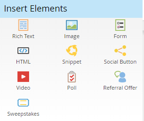
The major types of editable areas you will likely use are:
- Rich Text: General WYSIWYG editor that allows you to add copy, images, links, and format accordingly.
- Image: A region of the page that will always be an image, this brings up an image selection screen to upload from your PC, grab from the web, or select from the Design Studio. You are able to add links so the image is clickable, alt text, as well as advanced features like styles or CSS classes.
- Form: Only a form is able to be placed in this area. You can use variables to hide and show elements, so if you wanted the template to have a full-width form and a one-column form floating next to copy, code both into the page and use variables to show and hide depending on the page you are working on.
- Snippet: This allows the use of a snippet that has been created and approved.
Not used as often:
- Video: Similar to the image editable region, this allows only a video to be placed. Marketo only supports YouTube videos at this time, so if you use a different platform to host, the recommended option is a rich text area to embed the video.
- Share button
- Poll
- Referral
- Sweepstakes
If you are unsure of the type of content, or the area needs to be flexible for different types of content using the Text editable area. This will allow you to access the general WYSIWYG editor and allow you to add a wide variety of elements.
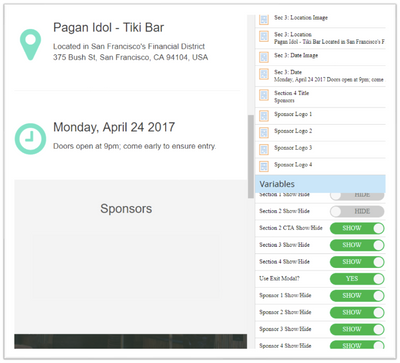
In areas that are not editable, you can utilize variables to switch out content such as a date, the color of a button, a link, or a logo. Again, this helps secure the structure and branding from being broken, while still allowing you to have the flexibility to change items from page to page.
The best part of the Guided template is the rendering of the page across devices is determined within the template. Therefore, your developer or agency can design the template to be fully responsive across all devices and you can simply edit the content within the page.
Below see the difference between the two editors.
Free-form:
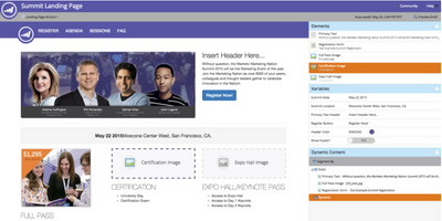
Guided:
For more information on landing page types, check out our Product Documentation on Guided and Free-Form Landing Pages.
Variables
Variables allow you to change the content in specific areas of the landing page without giving full editor access to the region. These are customizable attributes declared as meta tags inside the template to provide more flexibility in editing a landing page in areas that may need to be locked down from editing due to advanced coding or branding guidelines.
There are three types of variables for landing pages:
- String: Provides a text box to edit the content within the page. The colors, size, font, and other elements are locked down from being changed and this variable allows you to quickly change the wording of the content area.
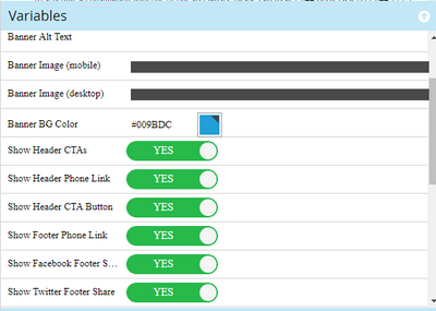
- Color: This allows you to easily swap colors using a color picker. This is great when using buttons, color bars, or rules, as well as background colors of sections! Without any CSS or HTML knowledge, you can quickly change the color scheme of a page by selecting a few different colors for the different variables set up.
- Boolean: This type of variable provides a toggle to switch between two predefined options. This is the variable with the most variety in uses. Anything you would like to add a conditional statement to so that it is either one choice or another can use this variable.
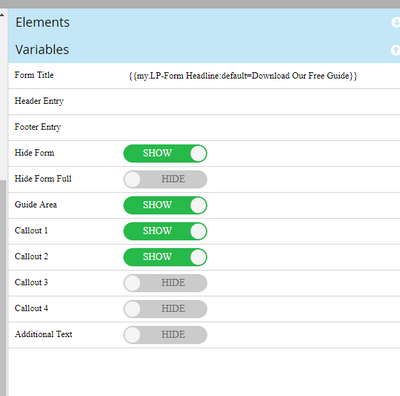
Within the syntax of the variable, your developer will assign a display name that is seen within the editor. This is where naming conventions become very important to ensure Marketo users know which variable will affect specific areas of the landing page. Boolean variables have additional options for displaying the name of each condition, here are a few examples:
- Hide and show: providing the ability to hide a specific section that is not needed within the campaign landing page you are building.
- Right or left-aligned: allows you to quickly change the alignment of a section with no need to jump into the editable area to make backend updates.
- Dark or light theme to a page: your developers have created a variable to allow you to change from a light design to a darker design with a flip of a toggle.
Below are some great examples that have been used frequently and how variables display within the editor of a landing page.
A/B Testing
What is it
Only 52% of those that use landing pages also test them to improve conversions. (1) Testing allows you to optimize conversion rates. This is a native, and frankly underused, feature. In Marketo, A/B test groups allow you to compare conversion rates of specific landing pages and optimize for the best results.
Why use it
The real question is—why not use it? A/B testing allows you to quickly gain insight into what’s working and what’s not. You’ll be able to gain valuable insights on the UX preferences of your audience.
How to use it
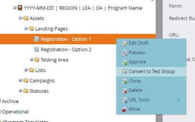
Landing pages are tested using a feature in Marketo called Landing Page Test Groups. First, you’ll create two or more landing pages that you would like to test against each other. Ideally, they will have forms. While still unapproved, right-click one and select convert to test group.
Add the landing pages that you would like to test and approve your test group. Once your landing pages are approved and live, you’ll be able to compare the stats of the landing pages in your test group.
When testing, every component is up for adjusting. However, there are some factors that may affect conversion more than others. Some examples include:
- Form placement and length
- Social proof
- Headline
- Copy
- Images
- CTA
- Button color
4 Keys to testing include:
- Define goals and baseline metrics
- Keep it simple and choose one variable at a time
- Test often
- Maintain a log of results
Resources:
- http://www.wordstream.com/blog/ws/2017/08/02/conversion-rate-statistics
- https://www.thinkwithgoogle.com/consumer-insights/the-changing-face-b2b-marketing
- https://conversionxl.com/blog/scarcity-examples/
- http://pages.etumos.com/updated-responsive-marketo-landing-page-templates-v2.html
You must be a registered user to add a comment. If you've already registered, sign in. Otherwise, register and sign in.
- Copyright © 2025 Adobe. All rights reserved.
- Privacy
- Community Guidelines
- Terms of use
- Do not sell my personal information
Adchoices
