- Marketing Nation
- :
- Products
- :
- Blogs
- :
- Product Blogs
- :
Form styling: How to position checkbox labels to the right of an input without CSS
- Subscribe to RSS Feed
- Mark as New
- Mark as Read
- Bookmark
- Subscribe
- Printer Friendly Page
- Report Inappropriate Content
- Mark as New
- Bookmark
- Subscribe
- Mute
- Subscribe to RSS Feed
- Permalink
- Report Inappropriate Content
When it comes to using a checkbox input, there are two options to choose from in the Marketo Form editor experience:
1) the checkbox field type (highlighted blue)
2) the checkboxes field type (highlighted yellow)
For me, the intuitive way of thinking about the checkbox field is as a "singular" field type which has the same options as the checkboxes field type, with the difference being that one is "single" and the other is "multiple". Seems to make sense, but come to find out, there's a much bigger difference between the field types -and- there's even a case for using the checkboxes field type for a single input (even as grammatically incorrect as that all sounds) in most situations.
Here's what the field types look like on a form in the Marketo Editor:
above: [green] Field labels ; [blue] checkbox field; [yellow] checkboxes field
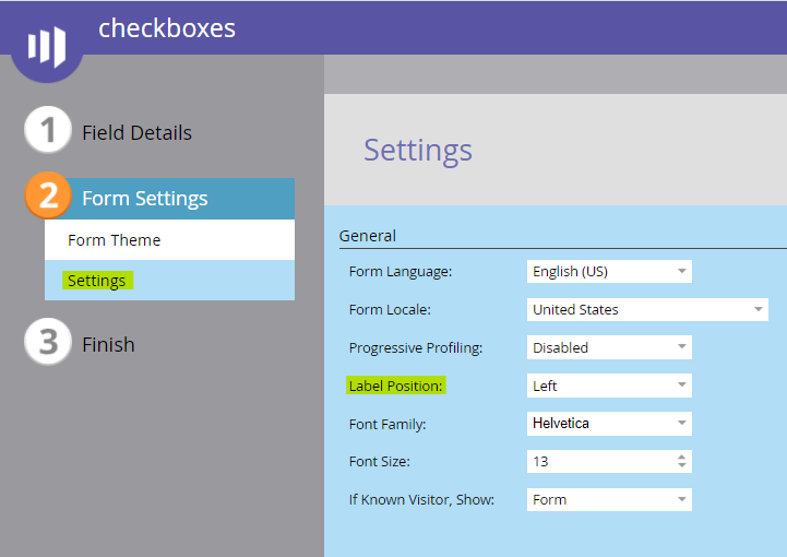
As you can see in the screenshot above, both the checkbox field (top) and the checkboxes field (bottom) have a label (green) to the left of the input. The location of this label is determined by the form settings choice for Label Position on page 2 - it defaults to "left" and can be changed to "above" (see below).
above: [yellow] Under the settings menu in the Form Editor (pg 2), set the label position to left or above.
When you're using a checkbox field type (like most of us do), the only option you've got to edit text is the label element. Most times what I've seen done (and then worked to correct) is using this label as the text "to the right" of the input by adding in a layer of CSS to position the checkbox to the left of the label -or- the label to the right of the input. In either case, you're adding complexity that probably doesn't need to exist.
Instead of getting into a knot with custom CSS on your forms, you could choose the checkboxes field type (even for just one checkbox!) and use the Display Value to show text to the right of the input. When setup this way you'll want to empty the actual field label unless you've got some reason to display text to the left or above the input in addition to the Display Value text.
When using the checkboxes field type, you'll get an option added into the blue right column of the editor labeled Values:. Clicking on the "Edit(1)" option will open a dialog window to edit the field values (see below).
above: [yellow] Under the Values menu, edit the Display Value to update the text to the right of the input; [green] The Stored Value is sent to the lead record
This is where the checkboxes field type really stands apart -- you can set both the Display Value (the value the user sees) as well as the Stored Value (the value the computer "sees") using an easy dialog menu. Just like you can add HTML to the label element, you can also add HTML to the Display Value to include things like links to a Privacy Policy or custom inline styling for the text.
As a 'bonus' feature of the checkboxes field type, you're also able to easily swap the label to the left of the input by unchecking the "Label to Right" input (picture above, just below the highlighted Values field in the right column).
Another advantage of going this way usually comes up a little further down the road but it has to do with hiding the field labels on a form -- lets say you've got a form with lots of fields and want to optimize the real estate a bit more by hiding the labels and using the Hint Text (placeholder) text instead. If you're using checkbox fields w/ Custom CSS that moves the label element to where the Display Value ought to be, then turning off the labels (hiding them) means your checkbox text goes away as well -- so now you're in a spot that you've got to add even more complex CSS to selective target the checkbox field (usually field ID-specific rather than field type-specific) which means scale and flexibility become more of a headache in the long run. And who likes headaches?
The takeaway:
Do your future-self a favor and try to use checkboxes field types -- even for only one input -- as much as possible. You'll appreciate the flexibility of the Display Value and Stored Value menu by comparison to the checkbox field type. You might also appreciate the time and money you save by not having to write custom CSS for something that Marketo already handles out of the box - work smarter, not harder!
You must be a registered user to add a comment. If you've already registered, sign in. Otherwise, register and sign in.
- Copyright © 2025 Adobe. All rights reserved.
- Privacy
- Community Guidelines
- Terms of use
- Do not sell my personal information
Adchoices


