Uber - An Example of the Future of Email Marketing
- Subscribe to RSS Feed
- Mark as New
- Mark as Read
- Bookmark
- Subscribe
- Printer Friendly Page
- Report Inappropriate Content
- Mark as New
- Bookmark
- Subscribe
- Mute
- Subscribe to RSS Feed
- Permalink
- Report Inappropriate Content
The first thing I do when I get to a new city is to see if they have Uber available. Uber has made it easier than ever before to get around in new places. I was recently in Taipei, and even though I cannot speak a word of Chinese (and the drivers English is usually no better than my Mandarin) I was able to get where I needed to go effortlessly with Uber.
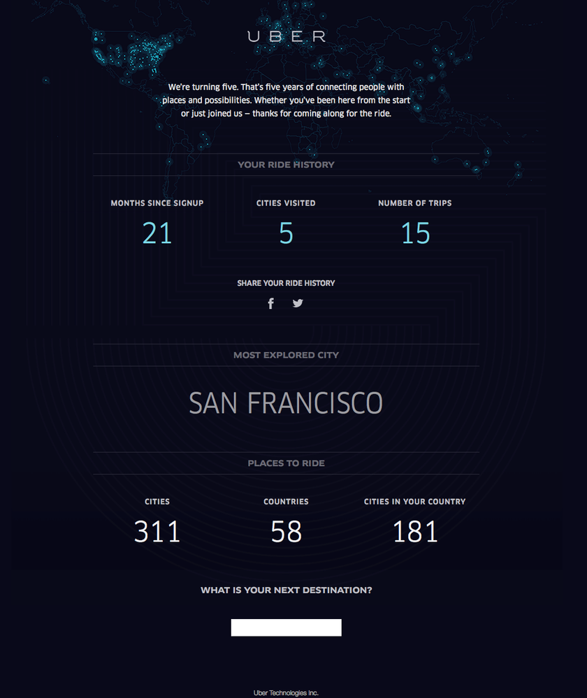
I recently got this email from them, and was blown away by the design, sophistication and execution of their email. It's not the first time I have been impressed by Uber's emails, but this one in particular stood out for me.
Animated
It's not visible in this screenshot, but the background of Uber's email is completely animated. The little dots flicker and glow adding an amazing visual dimension to the email. Since most emails are static (and may I say boring) this one really catches your eye, and tells the recipient that they are seeing something different. Capturing your audiences attention is one of the hardest things to do in email, but animation is a great way to get that extra second or two of attention, and then get your message across.
Personalized Analytics
Not only are there some great stats in the email, but Uber is actually taking my personal ride stats, and displaying them to me in a dynamic fashion. Marketo makes this possible with the use of tokens in your emails. This provides the recipient with a personalized experience, and makes them really feel like this email was made just for them.
Responsive
Surprisingly, many emails that Marketers send are still not using responsive emails. Uber does a great job of coding their email so it is fully responsive, so that no matter what device the recipient is on, they are able to get an amazing viewing experience. You can always tell if an email is responsive by dragging the size of your window and seeing if the layout changes. The best responsive emails are constantly rearranging things to suit the size of the screen. Here is what Uber's email looks like on typical phone dimensions.
Tested
The best emails work seamlessly across all devices. Regardless of if I look at Ubers email on my iPhone, iPad or MacBook, it looks great everywhere. Not surprising since I hear they hire a lot of former Litmus employees to work in their email marketing department ![]()
Beautiful
Last but not least, the email is beautifully designed. There is something about the simplicity, colors and layout that makes an email marketer like me happy!
Intrigue
Often a lost marketing art form, but the intrigue of the open text field asking where I will go next was too much for me not to click it, I had to see where it would take me.
That's it. Hopefully I have inspired you guys to go out there, and try and make an equally beautiful, thoughtful, analytical and personal email like Uber did!
Cheers!
You must be a registered user to add a comment. If you've already registered, sign in. Otherwise, register and sign in.
- Copyright © 2025 Adobe. All rights reserved.
- Privacy
- Community Guidelines
- Terms of use
- Do not sell my personal information
Adchoices

