Your Achievements
Next /
Sign inSign in to Community to gain points, level up, and earn exciting badges like the new Applaud 5 BadgeLearn more!
View All BadgesSign in to view all badges
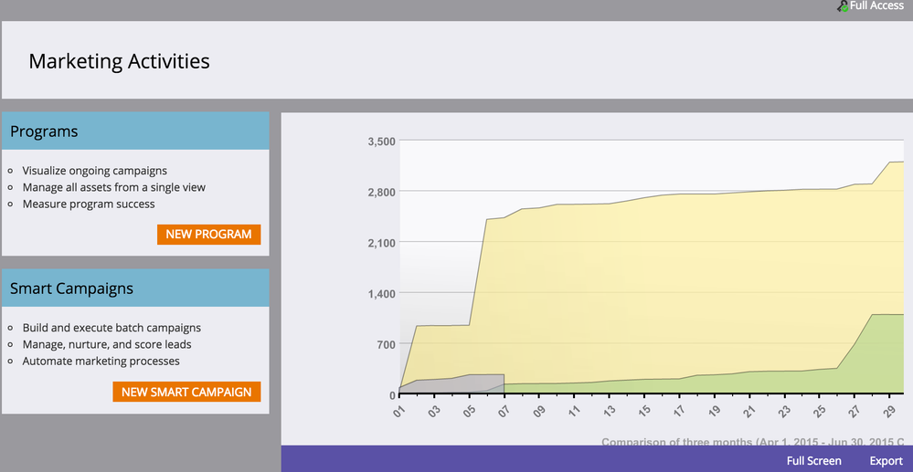
What does the graph on the main Marketing Activities screen show??
Topic Options
- Subscribe to RSS Feed
- Mark Topic as New
- Mark Topic as Read
- Float this Topic for Current User
- Bookmark
- Subscribe
- Printer Friendly Page
Anonymous
Not applicable
06-08-2015
06:01 AM
- Mark as New
- Bookmark
- Subscribe
- Mute
- Subscribe to RSS Feed
- Permalink
- Report Inappropriate Content
06-08-2015
06:01 AM
Hi folks! I cannot see a legend on this graph for what the yellow, green and purple represent, or find an explanation of what is shows. I'm sure I was told during training, but a legend on ALL graphs sure would be helpful.
2 REPLIES 2
Anonymous
Not applicable
06-08-2015
09:25 AM
- Mark as New
- Bookmark
- Subscribe
- Mute
- Subscribe to RSS Feed
- Permalink
- Report Inappropriate Content
06-08-2015
09:25 AM
I agree, I find a lot of the graphs pretty useless. Plus when you click on them they seem to start loading more info (mouse indicates action) but nothing happens.
- Mark as New
- Bookmark
- Subscribe
- Mute
- Subscribe to RSS Feed
- Permalink
- Report Inappropriate Content
06-08-2015
08:34 AM
This is the number of leads generated in the past 3 months by Day.
- Copyright © 2025 Adobe. All rights reserved.
- Privacy
- Community Guidelines
- Terms of use
- Do not sell my personal information
Adchoices
