Re: "The Fold" in emails
- Subscribe to RSS Feed
- Mark Topic as New
- Mark Topic as Read
- Float this Topic for Current User
- Bookmark
- Subscribe
- Printer Friendly Page
- Mark as New
- Bookmark
- Subscribe
- Mute
- Subscribe to RSS Feed
- Permalink
- Report Inappropriate Content
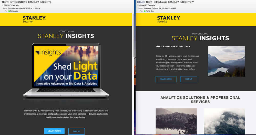
Opinion question for the masses... How do you feel about designing emails for the fold? Have you found keeping the CTA above the fold significantly increased open rates, or do you get better performance from hero images? I'm just curious to know what everyone's experiences have been regarding opens/clicks/conversions.
And I know, I know... Do an A/B Test. That'll likely happen, but I'm curious what other marketers think, too! ![]()
Here are a couple new email templates I've been working on this week:
- Mark as New
- Bookmark
- Subscribe
- Mute
- Subscribe to RSS Feed
- Permalink
- Report Inappropriate Content
Joe,
I don't think the fold would have any impact on open rates. For desktops, people are likely viewing in a preview pane--if they have images turned on, you'll record an open whether or not they scroll. And even then, the fold is different for horizontal and vertical split on the preview.
Subject line and copy is even more important on a smartphone. Chances are they're making a decision to open based on something that looks like this:
STANLEY Security 4:49PM
Introducing Stanley Insights
Based on over 30+ years securing retail
facilities, we are utilizing customized data,
And on a smartphone--which accounts for 50% or more of email traffic depending on which research outfit you believe--the fold is irrelevant as people are already in the habit of scrolling.
I think what you're really interested in is the click-to-open rate at a minimum, and more importantly, how many actually complete the form and sign up.
I don't know that I'd spend a lot of time worrying about the fold in an email--just my $0.02
- Mark as New
- Bookmark
- Subscribe
- Mute
- Subscribe to RSS Feed
- Permalink
- Report Inappropriate Content
Thanks for the sanity check, Steve! This is more or less the exact message I'm trying to evangelize to my team.
- Copyright © 2025 Adobe. All rights reserved.
- Privacy
- Community Guidelines
- Terms of use
- Do not sell my personal information
Adchoices
