- Marketing Nation
- :
- Products
- :
- Product Discussions
- :
- Marketo Form - Sizing dropdown field and mobile
Marketo Form - Sizing dropdown field and mobile
- Subscribe to RSS Feed
- Mark Topic as New
- Mark Topic as Read
- Float this Topic for Current User
- Bookmark
- Subscribe
- Printer Friendly Page
- Mark as New
- Bookmark
- Subscribe
- Mute
- Subscribe to RSS Feed
- Permalink
- Report Inappropriate Content
Hi there,
Two questions.
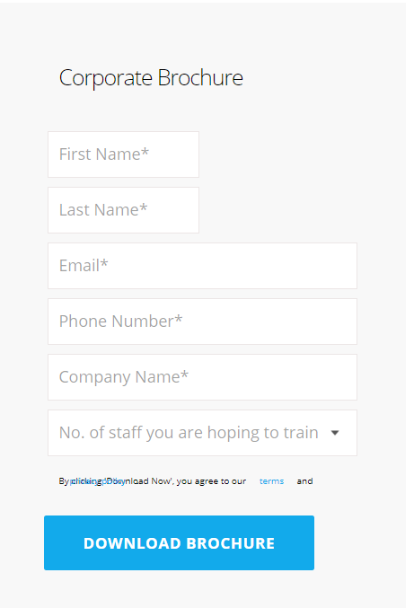
1. I have created a form and using the nth-of-type from the correct answer here - CSS for responsive Form fields (in 2 columns)? I have made the first two columns side by side.
Is there anyway I can make the columns 100% for mobile? do I use @media?
2nd Question.
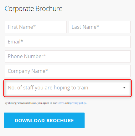
With the form I am trying to make the fields smaller which I have for each field apart from the dropdown. I have changed the padding to 9px when it was 14px 15px; padding.
Anybody know the code I need to add for the dropdown? (highlighted below)
Solved! Go to Solution.
Accepted Solutions
- Mark as New
- Bookmark
- Subscribe
- Mute
- Subscribe to RSS Feed
- Permalink
- Report Inappropriate Content
Hey Callum, I've got a few ideas for this-
As an aside, but food for thought:
I've had issues in the past targeting the <option> elements inside a <select> element (dropdown).
One method that did work for me to color that text was to target anything whose parent is a select element:
select > * { color: red !important; }
to the point....
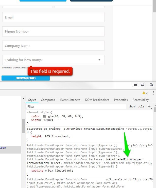
here's a snapshot of the CSS that's active (bold) on the select element. You can find this by using the "inspect" option in Chrome on any element on the page. This shows the different things that are going on in the page - in this case the rendered CSS. This is my best friend when debugging forms b/c you can see the "output" and source of things easily. The way this CSS is written, it's targeting the parent element (container) of the <form class="mktoForm" ..> element which contains the <select> element. Good news is that it looks like these styles are written into the custom CSS on your form. If you wanted to change just the select padding, you could use this code at the bottom of the Custom CSS on your form to override the padding (dont forget the !important flag).
While it makes sense in some cases to use the #mktoLoadedFormWrapper as the 'high-level' target for the CSS, it also creates a constraint that these styles will only apply to forms which are placed into that container. If that's the only form container you use, it shouldn't matter -- but if you wanted to override those styles, they'd have to be "more descriptive" (i.e. even higher-level container at the front) than the highlighted CSS rule OR they could have the exact same selector (#mktoLoadedFormWrapper form.mktoForm select) but the new CSS rule would have to be written after (below) this on the stylesheet.
I prefer to have the "form.mktoForm" be the leading selector so that the forms styles are more portable and would probably remove the #mktoLoadedFormWrapper target unless there was some specific reason to have it (i.e. if it's not on-purpose or functional, I'd ditch it all together). Always good to back-up your stylesheet before making changes like this, but you should be able to copy/paste all the code out of the Custom CSS editor within the form editor and safely save that somewhere else. Alternately, you can clone the form and adjust the styles on the new form -- that way you've got some before/after to compare.
In any case...
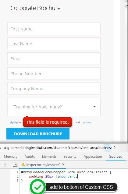
Here's a look at the select element with 20px of padding using the method above for reference:
Hopefully this covers the bases, let me know if there's anything else I missed here that'd be helpful?
- Mark as New
- Bookmark
- Subscribe
- Mute
- Subscribe to RSS Feed
- Permalink
- Report Inappropriate Content
Re: Marketo Form - Sizing dropdown field and mobile
Can you post a link to a form using the styles and I'll tell you what you need to change. Its hard to debug without the live code.
Thanks,
Gerard
- Mark as New
- Bookmark
- Subscribe
- Mute
- Subscribe to RSS Feed
- Permalink
- Report Inappropriate Content
Re: Marketo Form - Sizing dropdown field and mobile
Hi Gerard,
here you go - https://direct.digitalmarketinginstitute.com/students/courses/test-area/business-duplicate
- Mark as New
- Bookmark
- Subscribe
- Mute
- Subscribe to RSS Feed
- Permalink
- Report Inappropriate Content
Re: Marketo Form - Sizing dropdown field and mobile
- Mark as New
- Bookmark
- Subscribe
- Mute
- Subscribe to RSS Feed
- Permalink
- Report Inappropriate Content
Re: Marketo Form - Sizing dropdown field and mobile
Sure, sorry - https://digitalmarketinginstitute.com/students/courses/test-area/business-1 -- (changed the slug url but is the correct page)
- Mark as New
- Bookmark
- Subscribe
- Mute
- Subscribe to RSS Feed
- Permalink
- Report Inappropriate Content
Re: Marketo Form - Sizing dropdown field and mobile
weird.
This style targets the padding of the dropdown but the box stays the same size after the padding reduces. I'll keep trying to figure it out. Hopefully someone else has better luck in the meantime.
select#to_be_Trained__c.mktoField.mktoHasWidth.mktoRequired {padding:2px !important; }
- Mark as New
- Bookmark
- Subscribe
- Mute
- Subscribe to RSS Feed
- Permalink
- Report Inappropriate Content
Re: Marketo Form - Sizing dropdown field and mobile
Thats the same for me.
Will keep looking into it.
- Mark as New
- Bookmark
- Subscribe
- Mute
- Subscribe to RSS Feed
- Permalink
- Report Inappropriate Content
Re: Marketo Form - Sizing dropdown field and mobile
unless there is a better way I added
select#to_be_Trained__c.mktoField.mktoHasWidth.mktoRequired {height:85% !important; }
- Mark as New
- Bookmark
- Subscribe
- Mute
- Subscribe to RSS Feed
- Permalink
- Report Inappropriate Content
Hey Callum, I've got a few ideas for this-
As an aside, but food for thought:
I've had issues in the past targeting the <option> elements inside a <select> element (dropdown).
One method that did work for me to color that text was to target anything whose parent is a select element:
select > * { color: red !important; }
to the point....
here's a snapshot of the CSS that's active (bold) on the select element. You can find this by using the "inspect" option in Chrome on any element on the page. This shows the different things that are going on in the page - in this case the rendered CSS. This is my best friend when debugging forms b/c you can see the "output" and source of things easily. The way this CSS is written, it's targeting the parent element (container) of the <form class="mktoForm" ..> element which contains the <select> element. Good news is that it looks like these styles are written into the custom CSS on your form. If you wanted to change just the select padding, you could use this code at the bottom of the Custom CSS on your form to override the padding (dont forget the !important flag).
While it makes sense in some cases to use the #mktoLoadedFormWrapper as the 'high-level' target for the CSS, it also creates a constraint that these styles will only apply to forms which are placed into that container. If that's the only form container you use, it shouldn't matter -- but if you wanted to override those styles, they'd have to be "more descriptive" (i.e. even higher-level container at the front) than the highlighted CSS rule OR they could have the exact same selector (#mktoLoadedFormWrapper form.mktoForm select) but the new CSS rule would have to be written after (below) this on the stylesheet.
I prefer to have the "form.mktoForm" be the leading selector so that the forms styles are more portable and would probably remove the #mktoLoadedFormWrapper target unless there was some specific reason to have it (i.e. if it's not on-purpose or functional, I'd ditch it all together). Always good to back-up your stylesheet before making changes like this, but you should be able to copy/paste all the code out of the Custom CSS editor within the form editor and safely save that somewhere else. Alternately, you can clone the form and adjust the styles on the new form -- that way you've got some before/after to compare.
In any case...
Here's a look at the select element with 20px of padding using the method above for reference:
Hopefully this covers the bases, let me know if there's anything else I missed here that'd be helpful?
- Mark as New
- Bookmark
- Subscribe
- Mute
- Subscribe to RSS Feed
- Permalink
- Report Inappropriate Content
Re: Marketo Form - Sizing dropdown field and mobile
Hi Dave,
Thanks for the reply. This makes sense and looks great. I will certainly play around with what you have done and see what happens.
Really appreciate everyones help.
- Copyright © 2025 Adobe. All rights reserved.
- Privacy
- Terms of use
- Do not sell my personal information
Adchoices


.png)