- Marketing Nation
- :
- Products
- :
- Product Discussions
- :
- Make label wrap with two column checkboxes
Make label wrap with two column checkboxes
- Subscribe to RSS Feed
- Mark Topic as New
- Mark Topic as Read
- Float this Topic for Current User
- Bookmark
- Subscribe
- Printer Friendly Page
- Mark as New
- Bookmark
- Subscribe
- Mute
- Subscribe to RSS Feed
- Permalink
- Report Inappropriate Content
We are trying to figure out how to have a label for a checkboxes solution wrap onto the next line if the label is too long. Here is the current page: https://discover.semi.org/technology-communities-subscription-registration.html
You can see that the labels for checkboxes in the "I am interested in..." fieldset have significant problems. The fieldset has a single checkboxes field set up to be two columns. When the fieldset goes down to mobile size, it goes into 1 column but even then it can overflow the area. The team is currently limiting themselves on the length of the label so that it displays correct when the form is on a full width page, but this is less than ideal too. For instance the label "Semiconductor Cmpt., Instr. & Subsys." should really read "Semiconductor Components, Instruments and Subsystems" but that is way too long.
Is there a way to automatically get the form to display by wrapping any labels that overflow?
Thanks for your help!
Sheila
Solved! Go to Solution.
Accepted Solutions
- Mark as New
- Bookmark
- Subscribe
- Mute
- Subscribe to RSS Feed
- Permalink
- Report Inappropriate Content
Hey Sheila,
It looks like the way this is coded it's kind of missing the "fluid" styles that it needs to take the shape of it's container as you resize from mobile to tablet and then desktop.
I've fiddled w/ some CSS in the inspector here which you could add to your form in the "Custom CSS" dialog box on pg2 of the form editor. This should help to override a few of the issues in the theme stylesheet as well as address a few things that come from Marketo that make this not-so-responsive in the first place.
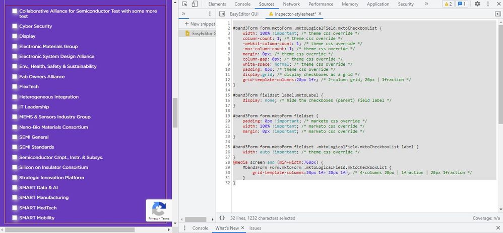
Here's a look at what Im seeing on my end w/ this CSS applied:

Above: desktop view has a total of 4 grid columns: 20px 1fr 20px 1fr
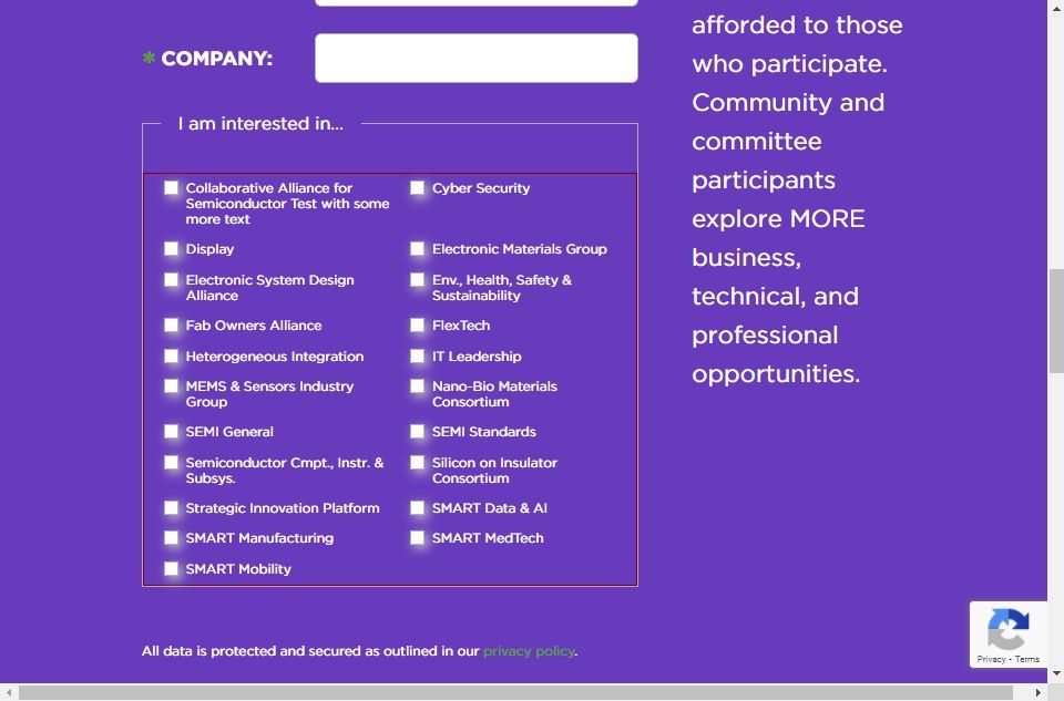
Above: Tablet view also has 4 grid columns: 20px 1fr 20px 1fr
Above: mobile view has 2 grid columns: 20px 1fr
Here's a copy of the CSS I've used in the browser to get these results:
#band3Form form.mktoForm .mktoLogicalField.mktoCheckboxList {
    width: 100% !important; /* theme css override */
    column-count: 1; /* theme css override */
    -webkit-column-count: 1; /* theme css override */
    -moz-column-count: 1; /* theme css override */
    margin: 0px; /* theme css override */
    column-gap: 0px; /* theme css override */
    white-space: normal; /* theme css override */
    padding: 0px; /* theme css override */
    display:grid; /* display checkboxes as a grid */
    grid-template-columns:20px 1fr; /* 2-column grid, 20px | 1fraction */
}

#band3Form fieldset label.mktoLabel {
    display: none; /* hide the checkboxes (parent) field label */
}

#band3Form form.mktoForm fieldset {
    padding: 0px !important; /* marketo css override */
    width: 100% !important; /* marketo css override */
    margin: 0px !important; /* marketo css override */
}

#band3Form form.mktoForm fieldset .mktoLogicalField.mktoCheckboxList label {
    width: auto !important; /* theme css override */
}
@media screen and (min-width:768px) {
    #band3Form form.mktoForm .mktoLogicalField.mktoCheckboxList {
        grid-template-columns:20px 1fr 20px 1fr; /* 4-columns 20px | 1fraction | 20px 1fraction */
    }
}
Let me know if you've got any questions about why what you had in there wasn't working or how any of this is working differently than it was before.
Thanks,
Dave
- Mark as New
- Bookmark
- Subscribe
- Mute
- Subscribe to RSS Feed
- Permalink
- Report Inappropriate Content
Re: Make label wrap with two column checkboxes
Hi Sheila,
There is a CSS issue on the form, the developer has added some odd styles which is resulting in the issue. Let us know if the issue doesn't get fixed.
Thanks,
Monali
- Mark as New
- Bookmark
- Subscribe
- Mute
- Subscribe to RSS Feed
- Permalink
- Report Inappropriate Content
Re: Make label wrap with two column checkboxes
@Sheila-SEMI, There are issues in the CSS and you need to work on fixing those issues. You also need to remove the white-space in CSS.
Try updating 480 media Query CSS with the below-mentioned code:
fieldset .mktoLogicalField.mktoCheckboxList {
white-space: unset;
margin-left: unset;
}
#band3Form .mktoCheckboxList label {
width: 100% !important;
}
#band3Form .mktoForm input[type="checkbox"] {
width: unset !important;
}
#band3Form .mktoForm label {
font-size: 14px !important;
line-height: 22px !important;
}
.mktoForm input[type=checkbox] + label:before, .mktoForm input[type=radio] + label:before {
margin-top: 4px;
}
Hope this helps!
- Mark as New
- Bookmark
- Subscribe
- Mute
- Subscribe to RSS Feed
- Permalink
- Report Inappropriate Content
Hey Sheila,
It looks like the way this is coded it's kind of missing the "fluid" styles that it needs to take the shape of it's container as you resize from mobile to tablet and then desktop.
I've fiddled w/ some CSS in the inspector here which you could add to your form in the "Custom CSS" dialog box on pg2 of the form editor. This should help to override a few of the issues in the theme stylesheet as well as address a few things that come from Marketo that make this not-so-responsive in the first place.
Here's a look at what Im seeing on my end w/ this CSS applied:

Above: desktop view has a total of 4 grid columns: 20px 1fr 20px 1fr

Above: Tablet view also has 4 grid columns: 20px 1fr 20px 1fr

Above: mobile view has 2 grid columns: 20px 1fr
Here's a copy of the CSS I've used in the browser to get these results:
#band3Form form.mktoForm .mktoLogicalField.mktoCheckboxList {
    width: 100% !important; /* theme css override */
    column-count: 1; /* theme css override */
    -webkit-column-count: 1; /* theme css override */
    -moz-column-count: 1; /* theme css override */
    margin: 0px; /* theme css override */
    column-gap: 0px; /* theme css override */
    white-space: normal; /* theme css override */
    padding: 0px; /* theme css override */
    display:grid; /* display checkboxes as a grid */
    grid-template-columns:20px 1fr; /* 2-column grid, 20px | 1fraction */
}

#band3Form fieldset label.mktoLabel {
    display: none; /* hide the checkboxes (parent) field label */
}

#band3Form form.mktoForm fieldset {
    padding: 0px !important; /* marketo css override */
    width: 100% !important; /* marketo css override */
    margin: 0px !important; /* marketo css override */
}

#band3Form form.mktoForm fieldset .mktoLogicalField.mktoCheckboxList label {
    width: auto !important; /* theme css override */
}
@media screen and (min-width:768px) {
    #band3Form form.mktoForm .mktoLogicalField.mktoCheckboxList {
        grid-template-columns:20px 1fr 20px 1fr; /* 4-columns 20px | 1fraction | 20px 1fraction */
    }
}
Let me know if you've got any questions about why what you had in there wasn't working or how any of this is working differently than it was before.
Thanks,
Dave
- Mark as New
- Bookmark
- Subscribe
- Mute
- Subscribe to RSS Feed
- Permalink
- Report Inappropriate Content
Re: Make label wrap with two column checkboxes
I can't thank you enough for helping with this! It is looking so much better than it was before. You can see it implemented here:
https://discover.semi.org/LP-Test-Form.html
The only thing I tweaked was to match the top and bottom margins of the checkboxes in the fieldset area.
Thank you, thank you, thank you!!
- Mark as New
- Bookmark
- Subscribe
- Mute
- Subscribe to RSS Feed
- Permalink
- Report Inappropriate Content
Re: Make label wrap with two column checkboxes
@Dave_Roberts - I just realized there is another issue on the form... I am trying to figure out how to fix... but if you have some suggestions I would appreciate it... I've tried somethings but my CSS skills are just not up to it.
If you select a opt-in country (Austria, Canada, UK, etc..) there is another checkbox for "Email Opt-In" that appears under the field set. You'll see that the checkbox is appearing over the Email Opt-in label. I can see using dev tools, that if I can add a "padding-left: 175px;" to the element "<label for="mktoOptIn" id="LblmktoOptIn"> that I can get the checkbox to line up... but I can't figure out how to write the CSS to do that. Would you be able to help me with this?
Thanks again!
- Mark as New
- Bookmark
- Subscribe
- Mute
- Subscribe to RSS Feed
- Permalink
- Report Inappropriate Content
Re: Make label wrap with two column checkboxes
This looks like it could be fixed by updating the form field from a "checkbox" field type to a "checkboxes" field type.
The long-and-short of it is that the "checkbox" field type does not have a label beside the field, whereas a "checkboxes" field type does have a label beside the field.
In this case, it looks like you've got a Rich Text element that's pretending to be a "label" (I agree to receive email ...) and the actual label of the field set to a different value (EMAIL OPT-IN). What you'll want to do is switch this field over to use the checkboxes field type (even though there's only one checkbox, what we're after is the built-in label-to-the-right-of-the-input). Once you change the field type, you'll want to remove the actual label text (EMAIL OPT-IN) from the field and then find the Values link in the right column of the editor (see attached).
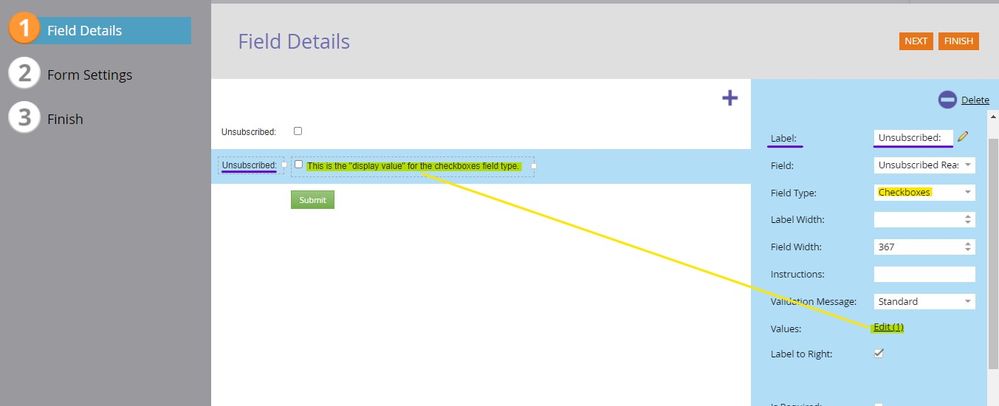
The idea here is to move what you've got setup in the Rich Text field into the "Values" menu to display it to the right of the input as shown in the highlighted text above.
To move this stuff over, click into your Rich Text "label" and then click the HTML icon on the toolbar to grab all the code in that field. Next, go back to your updated "checkboxes" field and click into the Values menu (where it says "Edit(1)" in the screenshot). This will pull up a dialog box with a link in the bottom left corner that should say "Advanced Editor" -- click that to bring up the screen below:
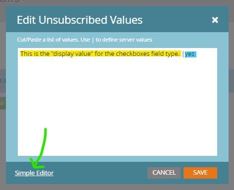
In this screen, I've clicked the "Advanced Editor" and now the link changes to show the "Simple Editor" link instead but it'll look different when you load the dialog menu each time.
To get the code you copied from your Rich Text section into the actual label for this field, you'll want to replace any text on the left side of the pipe (likely there won't be any b/c you just changed the field type) with the HTML you copied to the clipboard.
This next bit is important... this view of the Editor interprets a line break as a new field so you'll want to make sure that any code you paste in here does not have any line breaks (is minified) so that it reads as a single "label". To the right of all that code you just pasted, you'll want to make sure you've got 1) the pipe "|" to separate the display value (left) from the stored value (right), as well as 2) the actual stored value ('yes' in the examples).
Here's what I think that'll look like once you've got the pieces put together in the Values > Advanced Editor menu.
<small>I agree to receive email communications from SEMI. You can unsubscribe at any time by visiting the <a href="https://discover.semi.org/subscription-management.html" target="_blank" id="">subscription center</a>. All data is protected and secured as outlined in our <a href="https://www.semi.org/en/privacy-policy" target="_blank" id="">privacy policy</a>.</small> | yes
Finally, if you'd like to keep the EMAIL OPT-IN text above the field, you can add that into the Rich Text element in place of the other stuff you had in there and just set that atop your new checkboxes field type. We'll probably need to take another look at the checkboxes CSS to get it to display differently than the checkboxes field with 2-columns but I'd be happy to help tackle that part once you've got the field type switched over -- it'll be MUCH easier to work with the CSS at that point.
Let me know if you run into anything trying to set this up or have any questions about what's going on here. Once you've got the form field type changed over, shoot me an updated link here and I'll hop in to see if we can iron out any issues with the CSS from there.
Thanks,
Dave
- Mark as New
- Bookmark
- Subscribe
- Mute
- Subscribe to RSS Feed
- Permalink
- Report Inappropriate Content
Re: Make label wrap with two column checkboxes
In one of my iterations last night, I tried switching to checkboxes but didn't realize that I could add html into the actual value so I was still trying to keep it separate and putting the "Email Opt-In:" as the value instead. The text was too small and wasn't aligning. This is looking pretty good. The only challenge now is that the the grid for this is still setup for 2 but we want it to span all the way across the two columns for this section. I tried a few things with the CSS but it didn't work - I'm not sure how to get the grid to apply differently in this section then in the fieldset area!
You've been a lifesaver... I'm loving learning from you. Thank you so much!
Sheila
- Mark as New
- Bookmark
- Subscribe
- Mute
- Subscribe to RSS Feed
- Permalink
- Report Inappropriate Content
Re: Make label wrap with two column checkboxes
Hey Shelia, you're not alone with thinking that you couldn't put HTML into the Display Value for the checkboxes field, it comes up a lot in my experience. Thanks for getting the field type switched over, nice work there!
I was able to go in this morning and add a few more lines of CSS to the inspector here to straighten out the 2-column vs 1-column checkbox situation. The way I normally handle this situation where you want to style similar fields using two different sets of styles is to include one inside a fieldset and another outside a fieldset (like you've already got setup here conveniently). In this way, you can write a set of rules for "all checkboxes" (or whatever field type you're looking to style) and another rule for "all checkboxes within a fieldset parent container". This allows us to do 2-columns inside the fieldset and 1-column outside the fieldset.
I've done my best to comment the code here, but let me know if you've got any questions on any piece of it.
Basically, I needed to set some rules for the "all checkboxes" category and remove some margin, make it 100% width and I took the liberty to adjust the line-spacing so it was a little tighter for the smaller text (line 1-6).
For the checkboxes inside a fieldset, we'll then need to re-apply the margin and line-height that were already on the checkboxes (that got removed by the "all checkboxes" CSS) -- this is the second "group" of line in the CSS (line 7-11)
Finally, there's a really weird thing on the forms2.css stylesheet that adds padding to EVERY element on the form for displays up to 480px which is written poorly (desktop-first instead of mobile-first) and we needed to remove the add'l padding that adds to your forms to make it look better on mobile. (line 12-15).
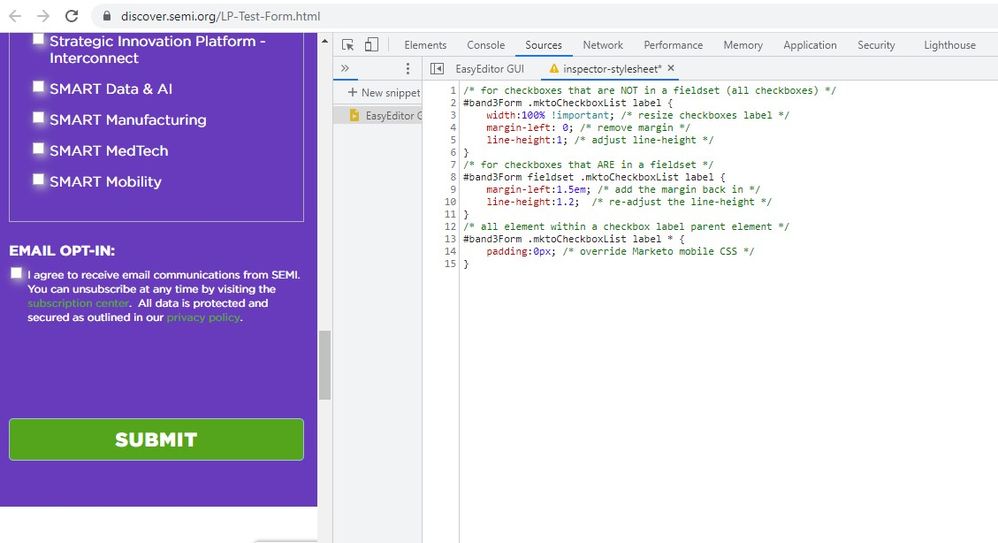
/* for checkboxes that are NOT in a fieldset (all checkboxes) */
#band3Form .mktoCheckboxList label {
    width:100% !important; /* resize checkboxes label */
    margin-left: 0; /* remove margin */
    line-height:1; /* adjust line-height */
}
/* for checkboxes that ARE in a fieldset */
#band3Form fieldset .mktoCheckboxList label {
    margin-left:1.5em; /* add the margin back in */
    line-height:1.2;  /* re-adjust the line-height */
}
/* all element within a checkbox label parent element */
#band3Form .mktoCheckboxList label * {
    padding:0px; /* override Marketo mobile CSS */
}
You should be able to pop this code into the end of your form's Custom CSS -- same place you put the other stuff -- and see similar results to the screenshot above.
Again, let me know if you've got any questions, Im glad I was able to help out here and even better to hear that you're learning along the way - that made my morning 🙂
- Mark as New
- Bookmark
- Subscribe
- Mute
- Subscribe to RSS Feed
- Permalink
- Report Inappropriate Content
Re: Make label wrap with two column checkboxes
The code worked great. Thank you sooo much! Now the checkboxes are working exactly as we need them to.
Would you mind if I asked you a couple more questions?
1) There is extra space between the last visible element on the form and the Submit button. When I look at the space using Chrome dev tools, it seems to be coming from the two things. One is the element that is hidden (either the email opt-in checkbox or the default text) as part of a placeholder element. The second is the hidden field, "MktoOptInSource". Do you have any suggestions on how to fix this extra space on the form?
2) I noticed in your screen shot, it looks like you have a Chrome plug-in called "EasyEditor GUI". Looks like it could be useful but I did a search and couldn't find it. Any hints on this?
Thanks again!!
Sheila
- Copyright © 2025 Adobe. All rights reserved.
- Privacy
- Terms of use
- Do not sell my personal information
Adchoices

.png)