Left aligning checkboxes + Centering Form on Page + Aligning Label + Label Text Description
- Subscribe to RSS Feed
- Mark Topic as New
- Mark Topic as Read
- Float this Topic for Current User
- Bookmark
- Subscribe
- Printer Friendly Page
- Mark as New
- Bookmark
- Subscribe
- Mute
- Subscribe to RSS Feed
- Permalink
- Report Inappropriate Content
I have this landing page I have started and have the age old problem of wanting to align my checkboxes left and labels right
engage.livelyme.com/unsubscribe-preference-center.html
The checkboxes should align with the label and the descriptor text should be directly underneath the label.
The form should be centered on the page.
I have read through several forum articles and applied custom CSS that solved this issue for others but I am still having this problem
I appreciate your time and assistance here.
- Labels:
-
Design Studio
-
layout
- Mark as New
- Bookmark
- Subscribe
- Mute
- Subscribe to RSS Feed
- Permalink
- Report Inappropriate Content
Check out the post here: https://nation.marketo.com/t5/Product-Blogs/Form-styling-How-to-position-checkbox-labels-to-the-righ...
It looks like you might be using the "checkbox" field type. Instead try using the "checkboxes" field type and that'll situation the label to the right of the input without the need for any fancy CSS.
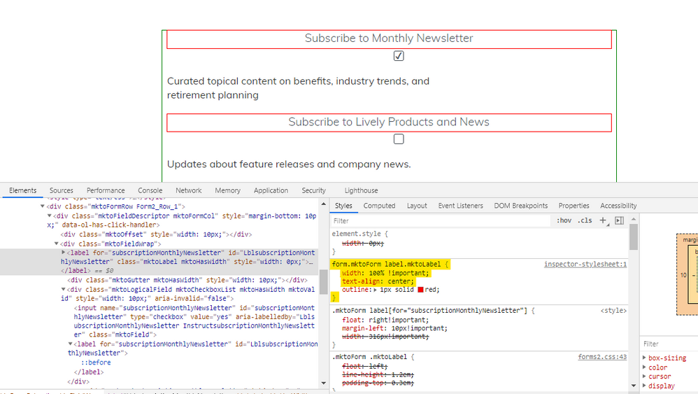
It looks like you've already got the form centered on the page, the issue appears to be with the labels and the checkbox vs checkboxes field types. In the shot below, I've outlined the form element in green and the labels in red so it's a little easier to see what's going on here.

To get the labels to center within the form, they need to be set to have a width of 100% and text-align: center (see highlighted code in the inspector). You don't need the not-highlighted "outline" style in there, that's just for the sake of example.
There may be a bit more to tidy up once you change over the checkbox fields to checkboxes, but I'd be better able to help iron that out once the form is updated and I can tinker around in the inspector on the preview link you provided to find the best solution if those don't snap right in.
Let me know if you've got any questions on swapping / adding any of the stuff above.
Thanks,
Dave
- Mark as New
- Bookmark
- Subscribe
- Mute
- Subscribe to RSS Feed
- Permalink
- Report Inappropriate Content
Hi and thank you @Dave_Roberts . This is where I am now:
engage.livelyme.com/unsubscribe-preference-center.html
- Mark as New
- Bookmark
- Subscribe
- Mute
- Subscribe to RSS Feed
- Permalink
- Report Inappropriate Content
Hey Jen, were you able to replace the checkbox field types with checkboxes field types?
I think you'll need to move the text out of the Rich Text elements that you're using as the labels for the checkboxes now and instead change the field type to checkboxes and move that text into the Display Value input. There's a few notes in the link in the post above for reference to this.
As-is the checkbox fields and the text that's used as labels aren't in the same container like they would be if you used the checkboxes field type (even for one checkbox at a time).
Let me know if you've got any question on getting that piece setup first or if maybe the link I've got here is pointing me to a version without that update for some reason.
Thanks,
Dave
- Mark as New
- Bookmark
- Subscribe
- Mute
- Subscribe to RSS Feed
- Permalink
- Report Inappropriate Content
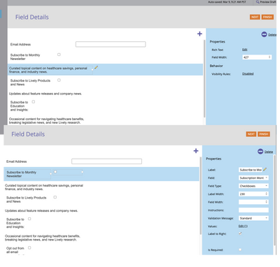
This is what I see on the page for the form:
I am setup using checkboxes and rich text:
Is this what you are seeing also?
- Mark as New
- Bookmark
- Subscribe
- Mute
- Subscribe to RSS Feed
- Permalink
- Report Inappropriate Content
Hey Jen,
It looks like all the text got moved to the Label input in the form editor in the latest revision, but it's still stacked atop the checkbox input. I think if you were to take everything you've got in the label input and add that into the Values pop-up in the Display Value input that it would work this out for you. That should move the text that's above the checkbox off to the right of the checkbox instead.
It looks like you've got the form centered on the page now, let me know if there's anything else you're trying to work out here.
- Copyright © 2025 Adobe. All rights reserved.
- Privacy
- Community Guidelines
- Terms of use
- Do not sell my personal information
Adchoices

