Re: Landing Page Template Hacks
- Subscribe to RSS Feed
- Mark Topic as New
- Mark Topic as Read
- Float this Topic for Current User
- Bookmark
- Subscribe
- Printer Friendly Page
- Mark as New
- Bookmark
- Subscribe
- Mute
- Subscribe to RSS Feed
- Permalink
- Report Inappropriate Content
Hi Everyone,
I've recently been playing around with guided landing pages and getting them to look and work exactly how I would like. Having customised a few of the Marketo template landing pages in the editor, I started to see a few elements I wanted to change. Adjust an image to a video, create additional sections etc.
When looking into the template HTML editor, I found it quite easy to simply change the 'div class' to a different element.
From
<div class="mktoImg alignleft" id="section5Image" mktoName="Section 5 Image" mktoImgClass="expandToFit" style="max-width:466px;"></div>
Change to
<div class="mktoVideo alignleft" id="section5Video" mktoName="Section 5 Video" mktoVideoClass="expandToFit" style="max-width:466px;"></div>
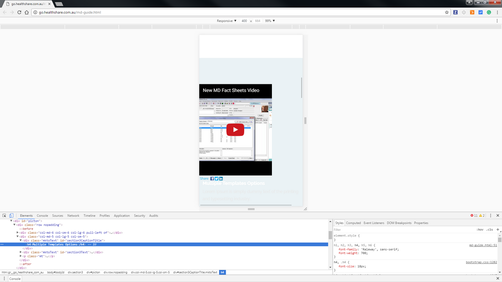
With this, I was now able to select a video instead of an image when creating a web page in the editor. One issue I came across was that in the mobile version the videos didn't align correctly (as shown in the image below). I was wondering if anyone with HTML design experience would have any suggestion? Has anyone developed a 'Hackers Guide to Landing Page Templates?' Keen to discuss this further.
The full HTML code of the section adjusted is below. (Template 15B)
<!-- /Section 2 -->
<!-- ********** BLUE SECTION - PICTON ********** -->
<div class="section3">
<div id="picton">
<div class="row nopadding">
<div class="col-md-6 col-sm-6 col-lg-6 pull-left of">
<div class="mktoVideo alignleft" id="section3Video" mktoName="Section 3 Video" mktoVideoClass="expandToFit" style="max-width:466px; min-width:466px;"></div>
</div>
<div class="col-md-5 col-lg-5 col-sm-5">
<div class="mktoText" id="section3CaptionTitle" mktoName="Section 3 Caption Title">
<h4>Multiple Templates Options</h4>
</div>
<div class="mktoText" id="section3Text" mktoName="Section 3 Text">
<p>Lorem Ipsum is simply dummy text of the printing and typesetting industry.</p>
<p>Lorem Ipsum has been the industry's standard dummy text ever since the 1500s, when an unknown printer took a galley of type and scrambled it to make a type specimen book.</p>
<p>It has survived not only five centuries, but also the leap into electronic typesetting, remaining essentially unchanged.</p>
</div>
<p class="mt"><a href="${section3ButtonLink}">
<button class="btn btn-white btn-theme">${section3ButtonLabel}</button>
</a></p>
</div>
</div>
<!--row -->
</div>
<!--/Picton -->
</div>
- Mark as New
- Bookmark
- Subscribe
- Mute
- Subscribe to RSS Feed
- Permalink
- Report Inappropriate Content
Partial fix found. By adjusting the minimum width size of the video it now will fit a mobile screen. I used min-width:300px to account for the biggest variety of screen sizes.
<div class="mktoVideo alignleft" id="section3Video" mktoName="Section 3 Video" mktoVideoClass="expandToFit" style="max-width:466px; min-width:300px;"></div>
The main classes you can use are:
mktoVideo
mktoImg
mktoForm
I'll post more findings as they come up.
- Mark as New
- Bookmark
- Subscribe
- Mute
- Subscribe to RSS Feed
- Permalink
- Report Inappropriate Content
Hi Travis,
It's a bit hard to give you tips on a fix if I can't see the live version.
My recommendation would be to try media queries for your class as I guess your div has a class .alignleft that you'd want to make changes to when screens are under approx. 480px in width. Although best case might be to add a new class that you just style for media queries.
Would also add a margin-top to it to be able to space it down a bit from the "Sign up now" button.
If you have a live link I could check it out.
/Erik
- Mark as New
- Bookmark
- Subscribe
- Mute
- Subscribe to RSS Feed
- Permalink
- Report Inappropriate Content
Thanks Erik, I'll look into the media queries as well as adding the mobile class. Below is a sample or the landing page I've bee testing. Videos now fit in a mobile view. My HTML skills are pretty basic at the moment but appreciate the tips!
go.healthshare.com.au/lp-12btest.html
- Mark as New
- Bookmark
- Subscribe
- Mute
- Subscribe to RSS Feed
- Permalink
- Report Inappropriate Content
Hi again,
I looked into it and it seems like the two have a bit different classes:
@media (max-width: 400px)
.cf_videoshare_container, .cf_videoshare_wrap, iframe, .mktoVideo {
width: 100% !important;
margin: 0 auto;
/* padding-left: 10px; */
padding-right: 10px;
}
I changed the width of this class when inspecting to 100% !important on @media (max-width: 400px)
The only issue is that the two were reversed in terms of which looked good, one looked good with padding-left: 10px only (the second one) and the other with only padding-right: 10px (the first one).
This actually looked better switching from 10px to 2% (works better across different screen sizes):
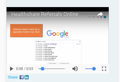
As you can see if I make the first one look nice in Mobile it messes up the second one. All this can be fixed by referring to them with a different class or id in the CSS.
Just giving you an example for experimenting.
/Erik
- Copyright © 2025 Adobe. All rights reserved.
- Privacy
- Community Guidelines
- Terms of use
- Do not sell my personal information
Adchoices


