Re: Landing Page CSS - Question
- Subscribe to RSS Feed
- Mark Topic as New
- Mark Topic as Read
- Float this Topic for Current User
- Bookmark
- Subscribe
- Printer Friendly Page
- Mark as New
- Bookmark
- Subscribe
- Mute
- Subscribe to RSS Feed
- Permalink
- Report Inappropriate Content
Hi everyone,
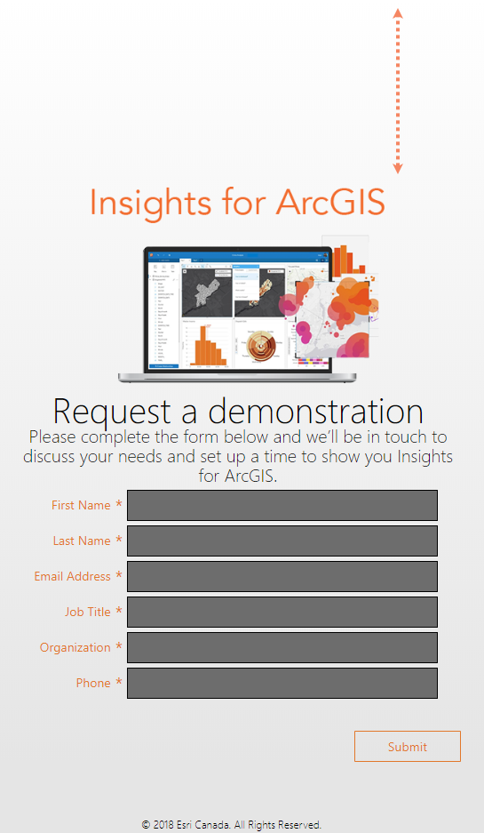
I took one of the Guided Landing Page template's Marketo offers and tried to strip it and simplify it. Basically we just wanted a page that hosted a banner and a form. For some reason though, we have this giant space at the top and I couldn't find what in the code could be causing this.
Any coding experts here have an idea what it could be? I have added the Guided Landing Page HTML template and our form CSS. The physical Marketo form also has a rich text field hosting the banner and description of the form.
Here is the landing page: https://pages.esri.ca/Insights-for-ArcGIS.html
Any tips or guidance is greatly appreciated, thank you in advance!
Solved! Go to Solution.
- Mark as New
- Bookmark
- Subscribe
- Mute
- Subscribe to RSS Feed
- Permalink
- Report Inappropriate Content
Hey Ayan,
You've got a div with the id "is" that has css styling for "padding-top: 10%". That's where it's coming from - you can reduce/remove that padding by updating that value ![]()
You can trouble shoot these issues by opening the page and right clicking anywhere and selecting "inspect", then running over sections until you find the issue - see below:
- Mark as New
- Bookmark
- Subscribe
- Mute
- Subscribe to RSS Feed
- Permalink
- Report Inappropriate Content
Thank you so much Grace Brebner! That did the trick, it looks much better now ![]() .
.
- Mark as New
- Bookmark
- Subscribe
- Mute
- Subscribe to RSS Feed
- Permalink
- Report Inappropriate Content
No problem, happy to help!
- Copyright © 2025 Adobe. All rights reserved.
- Privacy
- Community Guidelines
- Terms of use
- Do not sell my personal information
Adchoices

