Your Achievements
Next /
Sign inSign in to Community to gain points, level up, and earn exciting badges like the new Applaud 5 BadgeLearn more!
View All BadgesSign in to view all badges
SOLVED
Re: Importing the email mobile template from the program library
Go to solution
Topic Options
- Subscribe to RSS Feed
- Mark Topic as New
- Mark Topic as Read
- Float this Topic for Current User
- Bookmark
- Subscribe
- Printer Friendly Page
- Mark as New
- Bookmark
- Subscribe
- Mute
- Subscribe to RSS Feed
- Permalink
- Report Inappropriate Content
07-11-2013
11:14 AM
So I imported the mobile email template from the program library. I selected a folder to import to, but I had no idea that this was also going to populate the template section of Design Studio, so now it looks really cluttered there. Is this a new thing that's happening?
Solved! Go to Solution.
Labels:
- Labels:
-
Lead Management
1 ACCEPTED SOLUTION
Anonymous
Not applicable
07-11-2013
01:19 PM
- Mark as New
- Bookmark
- Subscribe
- Mute
- Subscribe to RSS Feed
- Permalink
- Report Inappropriate Content
07-11-2013
01:19 PM
Hi Michelle,
It did this for me too. I ended up making a template folder for these to live in within Design Studio and dragged each and every one into it.
It did this for me too. I ended up making a template folder for these to live in within Design Studio and dragged each and every one into it.
13 REPLIES 13
Anonymous
Not applicable
01-10-2014
03:46 PM
- Mark as New
- Bookmark
- Subscribe
- Mute
- Subscribe to RSS Feed
- Permalink
- Report Inappropriate Content
01-10-2014
03:46 PM
Anonymous
Not applicable
01-10-2014
03:35 PM
- Mark as New
- Bookmark
- Subscribe
- Mute
- Subscribe to RSS Feed
- Permalink
- Report Inappropriate Content
01-10-2014
03:35 PM
Is there a way to view email templates and programs before importing them?
- Mark as New
- Bookmark
- Subscribe
- Mute
- Subscribe to RSS Feed
- Permalink
- Report Inappropriate Content
07-16-2013
09:29 AM
Raj,
I tested one of the mobile email template, it's one of the first ones you had in the library. It's kind of hard to view because the font color appears faint on the iphone. Will try the other ones too.
I tested one of the mobile email template, it's one of the first ones you had in the library. It's kind of hard to view because the font color appears faint on the iphone. Will try the other ones too.
Anonymous
Not applicable
07-16-2013
06:40 AM
- Mark as New
- Bookmark
- Subscribe
- Mute
- Subscribe to RSS Feed
- Permalink
- Report Inappropriate Content
07-16-2013
06:40 AM
Gennadiy,
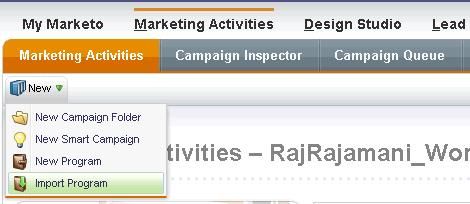
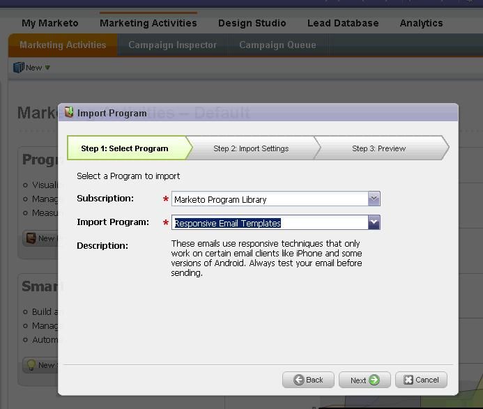
Follow the instructions to import from the program library - screenshots below


Follow the instructions to import from the program library - screenshots below


- Mark as New
- Bookmark
- Subscribe
- Mute
- Subscribe to RSS Feed
- Permalink
- Report Inappropriate Content
07-16-2013
06:07 AM
On a side note to go along with this, is there currently a way to get notified when new things are added to the library? I don't check regularly and was surprised the other day to find the mobile and responsive emails in there.
Anonymous
Not applicable
07-15-2013
08:21 PM
- Mark as New
- Bookmark
- Subscribe
- Mute
- Subscribe to RSS Feed
- Permalink
- Report Inappropriate Content
07-15-2013
08:21 PM
Michelle: start with Litmus blog posts. They have lots of useful info and stats on mobile. https://litmus.com/blog/mobile-email-compatibility-guide-what-works-where
Anonymous
Not applicable
07-15-2013
08:19 PM
- Mark as New
- Bookmark
- Subscribe
- Mute
- Subscribe to RSS Feed
- Permalink
- Report Inappropriate Content
07-15-2013
08:19 PM
Raj: may sound like a very simple question, but how do I access the Responsive Email Templates program?
- Mark as New
- Bookmark
- Subscribe
- Mute
- Subscribe to RSS Feed
- Permalink
- Report Inappropriate Content
07-12-2013
11:31 AM
Hi Raj,
I'll check them out. Because we're just starting out with responsibe emails, do you know what's a best practice when it comes to using graphics? Top of the page and using graphic on the body of the email? I noticed that the a few top graphic have the 185x60 and on a few that are ecommerce type mobile email, you have some below the copy as opposed to the right side of the text.
I'll check them out. Because we're just starting out with responsibe emails, do you know what's a best practice when it comes to using graphics? Top of the page and using graphic on the body of the email? I noticed that the a few top graphic have the 185x60 and on a few that are ecommerce type mobile email, you have some below the copy as opposed to the right side of the text.
Anonymous
Not applicable
07-12-2013
10:50 AM
- Mark as New
- Bookmark
- Subscribe
- Mute
- Subscribe to RSS Feed
- Permalink
- Report Inappropriate Content
07-12-2013
10:50 AM
Would love to get your feedback on the email templates. We are hoping to support responsive LPs before the end of the year.
- Mark as New
- Bookmark
- Subscribe
- Mute
- Subscribe to RSS Feed
- Permalink
- Report Inappropriate Content
07-12-2013
10:35 AM
Hi Raj,
Thanks! I saw, will look to see which ones we can use. Anything for landing pages yet?
Thanks! I saw, will look to see which ones we can use. Anything for landing pages yet?
Anonymous
Not applicable
07-12-2013
07:07 AM
- Mark as New
- Bookmark
- Subscribe
- Mute
- Subscribe to RSS Feed
- Permalink
- Report Inappropriate Content
07-12-2013
07:07 AM
Michelle/Emily,
We have added a lot more (30+) mobile templates in a program named "Responsive Email Templates" in the program library. You may want to try out these templates as well.
Raj
We have added a lot more (30+) mobile templates in a program named "Responsive Email Templates" in the program library. You may want to try out these templates as well.
Raj
- Mark as New
- Bookmark
- Subscribe
- Mute
- Subscribe to RSS Feed
- Permalink
- Report Inappropriate Content
07-11-2013
01:31 PM
I did the same thing and archived it.
Anonymous
Not applicable
07-11-2013
01:19 PM
- Mark as New
- Bookmark
- Subscribe
- Mute
- Subscribe to RSS Feed
- Permalink
- Report Inappropriate Content
07-11-2013
01:19 PM
Hi Michelle,
It did this for me too. I ended up making a template folder for these to live in within Design Studio and dragged each and every one into it.
It did this for me too. I ended up making a template folder for these to live in within Design Studio and dragged each and every one into it.
- Copyright © 2025 Adobe. All rights reserved.
- Privacy
- Community Guidelines
- Terms of use
- Do not sell my personal information
Adchoices