How do I make forms 2.0 submit button responsive like form fields?
- Subscribe to RSS Feed
- Mark Topic as New
- Mark Topic as Read
- Float this Topic for Current User
- Bookmark
- Subscribe
- Printer Friendly Page
- Mark as New
- Bookmark
- Subscribe
- Mute
- Subscribe to RSS Feed
- Permalink
- Report Inappropriate Content
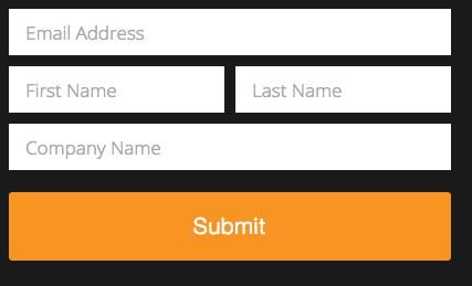
On desktop:

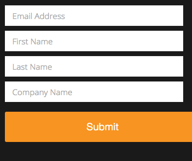
But on mobile, the form fields respond and the submit button gets cut off:

I'm assuming this is dealing with media queries, and was wondering if anyone has found a solution making the button respond with the form fields.
Thank you!!
Solved! Go to Solution.
- Labels:
-
Lead Management
- Mark as New
- Bookmark
- Subscribe
- Mute
- Subscribe to RSS Feed
- Permalink
- Report Inappropriate Content
You assume correctly. The media query (<= 480px) is applying style rules for the fields.
It looks like some custom styles are being used for the button, but there is no change to the button width at the 480px breakpoint.
Luckily, it looks like the button's alignment is already correct, so you just need to copy the width of the fields (which is 100%).
The following media query and CSS rule should be what you need; I almost always use it with Marketo forms. Adding this to the page's CSS should do the trick.
@media only screen and (max-width: 480px) {
.mktoForm .mktoButtonWrap.mktoSimple .mktoButton {
width: 100%;
}
}
Let me know if this makes sense! Sorry for the code drop; I figured I might as well just hand it over.
Best,
Kyle
- Mark as New
- Bookmark
- Subscribe
- Mute
- Subscribe to RSS Feed
- Permalink
- Report Inappropriate Content
I added the CSS you gave and the only other thing I had to do was add a max-width to the .mktoButtonWrap so it lined up perfect with the form fields.
.mktoButtonWrap {
width: 100% !important;
max-width: 400px !important;
}
Thanks again for the help!
- Mark as New
- Bookmark
- Subscribe
- Mute
- Subscribe to RSS Feed
- Permalink
- Report Inappropriate Content
added the code and still get the same problem with the submit button falling off screen...any help would be great
- Mark as New
- Bookmark
- Subscribe
- Mute
- Subscribe to RSS Feed
- Permalink
- Report Inappropriate Content
Can you post a link to your actual LP w/form?
- Mark as New
- Bookmark
- Subscribe
- Mute
- Subscribe to RSS Feed
- Permalink
- Report Inappropriate Content
at a loss...am I missing something?
HEALTHCAREfirst
- Mark as New
- Bookmark
- Subscribe
- Mute
- Subscribe to RSS Feed
- Permalink
- Report Inappropriate Content
.mktoButtonWrap {
margin-left: 0 !important;
}
.mktoButtonWrap .mktoButton {
width: 100%;
}
- Mark as New
- Bookmark
- Subscribe
- Mute
- Subscribe to RSS Feed
- Permalink
- Report Inappropriate Content
do I put this in the css only in the template or just the custom css in the form only?
- Mark as New
- Bookmark
- Subscribe
- Mute
- Subscribe to RSS Feed
- Permalink
- Report Inappropriate Content
worked like a charm in mobile...but flushes button to the far left under field titles...it would be nice to slide it over to center under form fileds then shift to the left in mobile...am I asking too much ![]()
- Mark as New
- Bookmark
- Subscribe
- Mute
- Subscribe to RSS Feed
- Permalink
- Report Inappropriate Content
Sanford, I cannot thank you enough my friend. The button issue on mobile devices has drove me nuts for a long time..Kudos.
- Mark as New
- Bookmark
- Subscribe
- Mute
- Subscribe to RSS Feed
- Permalink
- Report Inappropriate Content
Just put the mobile CSS in your responsive section.
- Mark as New
- Bookmark
- Subscribe
- Mute
- Subscribe to RSS Feed
- Permalink
- Report Inappropriate Content
You assume correctly. The media query (<= 480px) is applying style rules for the fields.
It looks like some custom styles are being used for the button, but there is no change to the button width at the 480px breakpoint.
Luckily, it looks like the button's alignment is already correct, so you just need to copy the width of the fields (which is 100%).
The following media query and CSS rule should be what you need; I almost always use it with Marketo forms. Adding this to the page's CSS should do the trick.
@media only screen and (max-width: 480px) {
.mktoForm .mktoButtonWrap.mktoSimple .mktoButton {
width: 100%;
}
}
Let me know if this makes sense! Sorry for the code drop; I figured I might as well just hand it over.
Best,
Kyle
- Mark as New
- Bookmark
- Subscribe
- Mute
- Subscribe to RSS Feed
- Permalink
- Report Inappropriate Content
I've just had to make sure on the form edit page that it's aligned to the left and just use JQuery on the page to set it better.
- Copyright © 2025 Adobe. All rights reserved.
- Privacy
- Community Guidelines
- Terms of use
- Do not sell my personal information
Adchoices