Help with Custom CSS on a Form and Landing Page
- Subscribe to RSS Feed
- Mark Topic as New
- Mark Topic as Read
- Float this Topic for Current User
- Bookmark
- Subscribe
- Printer Friendly Page
- Mark as New
- Bookmark
- Subscribe
- Mute
- Subscribe to RSS Feed
- Permalink
- Report Inappropriate Content
I am trying to add a new field to a form that contains custom CSS on a Landing Page with a JavaScript section that also contains form formatting. The person who created the original form and LP is no longer with the company. Adding the new field messes up the format. I'm not a coder and can't figure out how to make the form look right with the new field. I'm hoping that for someone who does know CSS and Marketo forms that it would be easy to spot what to do to fix this. If so, I'd be grateful for help. If it's not a simple solution that you can just provide here, feel free to let me know that. Thank you!
Original LP:
https://go.veritivcorp.com/Cleanliness-at-Work.html
Test LP with with a new field added to a copy of the form:
https://go.veritivcorp.com/Web-Content-1906-Cleanliness-at-Work-Guide-Download_LP-Request-copy.html
JavaScript Section in the LP (in the test LP, I replaced the original form ID with the new form ID - I got that far!):
<div>
<script>
// <![CDATA[
MktoForms2.whenReady(function(form){
vrtvMktoFormatting();
});
function vrtvMktoFormatting() {
$('.mktoFormRow').each(function() {
if ($(this).children('.mktoFieldDescriptor').length > 1 ){
if ($(this).children('.mktoFieldDescriptor').length == 2) {
$(this).addClass("block-two");
} else if ($(this).children('.mktoFieldDescriptor').length == 3) {
$(this).addClass("block-three");
} else {
$(this).addClass("block-four");
}
}
});
$('#mktoForm_9288').addClass('vrtvMktoForm');
$('#mktoForm_9288').removeAttr('style');
$('.mktoForm input, .mktoForm textarea, .mktoForm label, .mktoForm .mktoFormCol, .mktoForm .mktoButtonWrap, .mktoRequired, select, mktoHasWidth').removeAttr('style');

$('.mktoForm').css('width', '100%');
$('.mktoOffset, .mktoGutter').remove();
$('label').addClass('mktoVrtvLabel').removeClass('mktoLabel');

$('input.mktoField, input.mktoTextField').removeClass('mktoField').removeClass('mktoTextField');
$('.mktoFieldWrap').removeClass('mktoFieldWrap');
$('.mktoFormCol').removeClass('mktoFormCol');
$('.mktoButtonRow').removeClass('mktoButtonRow');
$('.mktoForm button').addClass('as-b').removeClass('mktoButton');
};
MktoForms2.onFormRender(function (form) {
vrtvMktoFormatting();
});
// ]]></script>
</div>
Custom CSS in form:
input[type=checkbox], .mktoForm input[type=radio] {
margin-top: 1rem !important;
}
@media screen and (max-width: 991px) {
input[type=checkbox], .mktoForm input[type=radio] {
margin-top: 2rem !important;
}
}
@media screen and (max-width: 1199px) {
input[type=checkbox], .mktoForm input[type=radio] {
margin-top: 0rem !important;
}
}
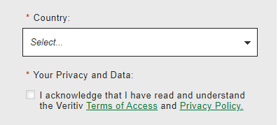
For reference, this is the way we want the new field to display on the form (not the gray background - just the placement of the form field and label):
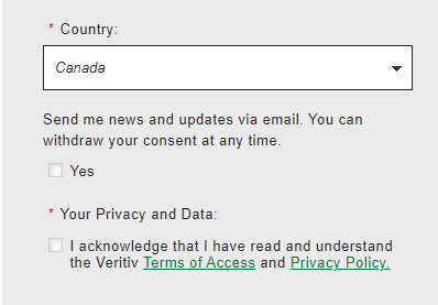
And this is what it looks like if Canada is selected as a Country on an LP where the form behaves as desired:
Solved! Go to Solution.
- Mark as New
- Bookmark
- Subscribe
- Mute
- Subscribe to RSS Feed
- Permalink
- Report Inappropriate Content
Hey Denise,
Thanks for posting all the code and details here, it made it much easier to work thru and find a solution.
It looks like there's a few issues to work around here but I think I've got something for you that'll work for this situation. Overall the issue(s) seem to stem from using JS and CSS to override or remove the native classes to try and force something else to happen with the styling rather than working in harmony with what Marketo already provides.
The CSS below is a combination of restoring the native checkboxes and removing some of the other overriding CSS to get this back to a happy place. I've added some /* comments */ inline above each piece of code to help give you an idea for what each piece is doing, but please let me know if you've got any specific questions about any of it.
To get this to match the screenshot attached, you can open up this form in the form editor and add the following CSS to the bottom of the Custom CSS input (below anything that already exists on the form).
/* restore native checkbox display */
.mktoForm input[type=checkbox] {
    opacity: 1;
    margin: 0px !important;
    float: left !important;
    margin-right: 10px !important;
}
/* hide fake checkbox element */
.mktoForm input[type=checkbox] + label:before {
    display: none !important;
}
/* get rid of negative top margin */
.mktoForm .mktoRadioList, .mktoForm .mktoCheckboxList {
    margin-top: 0px !important;
    padding: 0px !important;
}
/* indent checkbox label */
.vrtvMktoForm .mktoLogicalField label.mktoVrtvLabel {
    margin-left: 20px !important;
}

/* fix mobile label width issue */
.vrtvMktoForm label.mktoVrtvLabel {
    width: 100% !important;
    padding-bottom: 5px !important;
    margin-bottom: 0px !important;
}

.mktoAsterix {
    float: left !important;
    padding-left: 0px !important;
    padding-right: 5px !important;
}
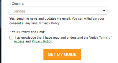
Here's a look at what I see when I put this CSS into the browser console for reference:
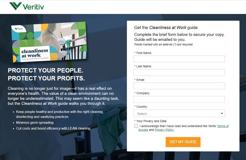
Let me know if there's anything else I can help sort out with this one or if something isn't rendering the way you'd expect once you get this setup on the form.
Thanks,
Dave
- Mark as New
- Bookmark
- Subscribe
- Mute
- Subscribe to RSS Feed
- Permalink
- Report Inappropriate Content
Hey Denise,
Thanks for posting all the code and details here, it made it much easier to work thru and find a solution.
It looks like there's a few issues to work around here but I think I've got something for you that'll work for this situation. Overall the issue(s) seem to stem from using JS and CSS to override or remove the native classes to try and force something else to happen with the styling rather than working in harmony with what Marketo already provides.
The CSS below is a combination of restoring the native checkboxes and removing some of the other overriding CSS to get this back to a happy place. I've added some /* comments */ inline above each piece of code to help give you an idea for what each piece is doing, but please let me know if you've got any specific questions about any of it.
To get this to match the screenshot attached, you can open up this form in the form editor and add the following CSS to the bottom of the Custom CSS input (below anything that already exists on the form).
/* restore native checkbox display */
.mktoForm input[type=checkbox] {
    opacity: 1;
    margin: 0px !important;
    float: left !important;
    margin-right: 10px !important;
}
/* hide fake checkbox element */
.mktoForm input[type=checkbox] + label:before {
    display: none !important;
}
/* get rid of negative top margin */
.mktoForm .mktoRadioList, .mktoForm .mktoCheckboxList {
    margin-top: 0px !important;
    padding: 0px !important;
}
/* indent checkbox label */
.vrtvMktoForm .mktoLogicalField label.mktoVrtvLabel {
    margin-left: 20px !important;
}

/* fix mobile label width issue */
.vrtvMktoForm label.mktoVrtvLabel {
    width: 100% !important;
    padding-bottom: 5px !important;
    margin-bottom: 0px !important;
}

.mktoAsterix {
    float: left !important;
    padding-left: 0px !important;
    padding-right: 5px !important;
}
Here's a look at what I see when I put this CSS into the browser console for reference:

Let me know if there's anything else I can help sort out with this one or if something isn't rendering the way you'd expect once you get this setup on the form.
Thanks,
Dave
- Mark as New
- Bookmark
- Subscribe
- Mute
- Subscribe to RSS Feed
- Permalink
- Report Inappropriate Content
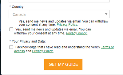
Hi @Dave_Roberts - I got waylaid this morning but I just tested out the CSS you gave me and it works perfectly except that the formatting of the checkbox field (and label) that appears if you select Canada as a country is messed up. What would I add to fix that?
https://go.veritivcorp.com/Web-Content-1906-Cleanliness-at-Work-Guide-Download_LP-Request-copy.html
To see that field display correctly, you can look at this LP (the original):
https://go.veritivcorp.com/Cleanliness-at-Work.html
- Mark as New
- Bookmark
- Subscribe
- Mute
- Subscribe to RSS Feed
- Permalink
- Report Inappropriate Content
Hi @Dave_Roberts - I was playing around with this and I tried making the field that is shown when Canada is selected for Country into a checkboxes field rather than a checkbox field (just like the Your Privacy and Data Policy below it). When I do that the field displays correctly but the label is repeated. And I swear it is not repeated on the form itself. So I am baffled.
UPDATE: I think the "extra" label was coming from inside the visibility rules. But removing it removes the label entirely. So for now I changed the field back into a checkbox - which doesn't display correctly - per my original post of today (sorry - I just couldn't leave it alone - it was so tantalizingly close!).
- Mark as New
- Bookmark
- Subscribe
- Mute
- Subscribe to RSS Feed
- Permalink
- Report Inappropriate Content
Hi @Dave_Roberts - Please forgive me for SO MANY messages! I finally just started over with a new copy of the form and methodically made changes to it - including the custom CSS that you so very kindly provided. I changed the "Canada Opt-In" field from a checkbox to a checkboxes field. Removed both labels. And now it's working. Thank you, thank you, thank you!!!!!
- Mark as New
- Bookmark
- Subscribe
- Mute
- Subscribe to RSS Feed
- Permalink
- Report Inappropriate Content
Thanks for the updates and for digging in to build this up from the start and get it working, good stuff here!
::long-distance-high-five::
For what it's worth, I tell everyone I can to that it's a good idea to use the checkboxes field type (even one checkbox input) b/c it comes paired with the text to the right of the input while the checkbox field type does not. What happens in a lot of situations that I've seen is that some CSS/JS gets written to make a "checkbox" field type act like a "checkboxes" field type (eg. display the label to the right of the input rather than above it) and then that ends up messing something up down the line. Using the native "checkboxes" field type is just a better solution all the way around and doesn't require anything special from CSS or JS to look right on the page.
Reach out again if you run into any other issues with other forms -- I suspect that piece of JS that's changing the classes of the Marketo Form elements is going to be problematic in the future (or at least something to work around) and I'd be happy to help again if/when something comes up.
- Mark as New
- Bookmark
- Subscribe
- Mute
- Subscribe to RSS Feed
- Permalink
- Report Inappropriate Content
Here's some CSS that'll hide paragraphs inside of a label. You might look at the form and see if the paragraph is actually inside the label and remove it that way, but this'll hide the whole thing to get you to a quick solution here:
.mktoForm label > p {
    display: none;
}

- Mark as New
- Bookmark
- Subscribe
- Mute
- Subscribe to RSS Feed
- Permalink
- Report Inappropriate Content
Hi @Dave_Roberts - I'm confused. I saw your code for hiding the label late (the way the discussion gets ordered is odd). So I changed the field that only shows if Canada is displayed back to a checkboxes field. And now my checkbox is gone - only the label appears:
Any idea as to what I could have done to make that happen?
- Mark as New
- Bookmark
- Subscribe
- Mute
- Subscribe to RSS Feed
- Permalink
- Report Inappropriate Content
Hi @Dave_Roberts - Thank you very much!! I will try this out in the morning and report back.
- Copyright © 2025 Adobe. All rights reserved.
- Privacy
- Community Guidelines
- Terms of use
- Do not sell my personal information
Adchoices
