Get 2 column form fields to be responsive to container
- Subscribe to RSS Feed
- Mark Topic as New
- Mark Topic as Read
- Float this Topic for Current User
- Bookmark
- Subscribe
- Printer Friendly Page
- Mark as New
- Bookmark
- Subscribe
- Mute
- Subscribe to RSS Feed
- Permalink
- Report Inappropriate Content
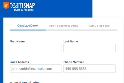
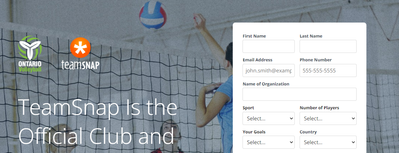
We are trying to use on embedded form on various non-mkto pages, being held in various sized containers, and I am looking to figure out how to make the 2-column form either be a smaller width 2-column form, and for the larger container one - span the form/fields evenly to fit the width of the larger container. For example - this page should have a 2-column form just smaller fields to fit the container (https://marketo-conversion--marketing-stage.netlify.app/ontario-volleyball-association). This is the same form in a different container, and see how there is more whitespace to the right (https://marketo-conversion--marketing-stage.netlify.app/leagues-and-clubs/signup) - click on "Sign up for a Trial" on the top tabs. And since one field spans the 2 columns - its responsiveness is non-existent in both scenarios.
- Mark as New
- Bookmark
- Subscribe
- Mute
- Subscribe to RSS Feed
- Permalink
- Report Inappropriate Content
Hi @Mike_TS ,
For this page - https://marketo-conversion--marketing-stage.netlify.app/leagues-and-clubs/signup
Add this CSS ---

.mktoFieldDescriptor.mktoFormCol {
    width: calc(100% / 2)!important;
    padding: 0 15px 0 0;
}

.mktoFormRow .mktoFormCol:nth-child(2) {
    padding: 0 !important;
}
.mktoFormCol:nth-last-child(2):first-child {
    width: 100% !important;
    padding: 0 !important;
}

And, Remove this CSS ---

#mktoForm_1001.mktoForm .mktoFormCol {
    /* margin-right: 10px !important; */
    /* min-height: 0px !important; */
}
And, it will come like this -
I'm checking the another one.
Thanks!
Jasbir
- Mark as New
- Bookmark
- Subscribe
- Mute
- Subscribe to RSS Feed
- Permalink
- Report Inappropriate Content
For the
Add the below CSS ---

.mktoFieldDescriptor.mktoFormCol {
    width: calc(100% / 2)!important;
    padding: 0 15px 0 0;
}
.mktoFormRow .mktoFormCol:nth-child(2) {
    padding: 0 !important;
}
.mktoOffset {
    display: none !important;
}
.mktoFormCol:nth-last-child(2):first-child {
    width: 100% !important;
    padding: 0 !important;
}

** In the below add width: 100% - **

#mktoForm_1001.mktoForm input[type="text"], #mktoForm_1001.mktoForm input[type="url"], #mktoForm_1001.mktoForm input[type="email"], #mktoForm_1001.mktoForm input[type="tel"], #mktoForm_1001.mktoForm input[type="number"], #mktoForm_1001.mktoForm input[type="date"], #mktoForm_1001.mktoForm textarea.mktoField, #mktoForm_1001.mktoForm select.mktoField{
width: 100% !important;
}

And, Remove this CSS ---

#mktoForm_1001.mktoForm .mktoFormCol
    /* margin-right: 10px !important; */
    /* min-height: 0px !important; */
}
And, it will show like this -
Thanks!
Jasbir
- Mark as New
- Bookmark
- Subscribe
- Mute
- Subscribe to RSS Feed
- Permalink
- Report Inappropriate Content
I'm trying to implement this on a web page using the standard embed code, but am not having any luck getting the two column layout to work. Are you adding the CSS to the "CSS section" of the Marketo form (in Marketo) or adding the CSS to the web page? Is this something we could possibly hire to implement?
- Mark as New
- Bookmark
- Subscribe
- Mute
- Subscribe to RSS Feed
- Permalink
- Report Inappropriate Content
Hi @moniqueak_az, I can see that 2 columne layout is coming in desktop version as well as mobile version.
Let me know what kind of fix you want here.
- Copyright © 2025 Adobe. All rights reserved.
- Privacy
- Community Guidelines
- Terms of use
- Do not sell my personal information
Adchoices

