Forms 2.0 CSS for hidden field
- Subscribe to RSS Feed
- Mark Topic as New
- Mark Topic as Read
- Float this Topic for Current User
- Bookmark
- Subscribe
- Printer Friendly Page
- Mark as New
- Bookmark
- Subscribe
- Mute
- Subscribe to RSS Feed
- Permalink
- Report Inappropriate Content
Hello!
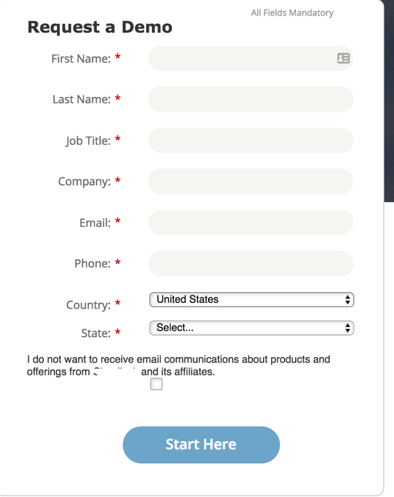
I'm new to the CSS world and have a challenge where I need the text of a hidden checkbox field (displayed by visibility rules) to align better with the rest of the form. In the image below, the text is off and while I have tried adjusting the label/field width, it doesn't work. In terms of CSS for the form, is there a recommended code to adjust only that field so that it's a bit more centered and the checkbox is inline with the rest of the text?
- Mark as New
- Bookmark
- Subscribe
- Mute
- Subscribe to RSS Feed
- Permalink
- Report Inappropriate Content
Don't know what alignment you're going for ("a bit more centered" isn't enough), but you can start restyling your particular form with this:
.mktoFormRow .mktoHasWidth[for="Unsubscribed"] {
width: 250px !important;
float: right;
}
.mktoFormRow .mktoHasWidth[for="Unsubscribed"] ~ .mktoCheckboxList {
margin-top: 6px;
}
.mktoFormRow .mktoHasWidth[for="Unsubscribed"] ~ .mktoCheckboxList input {
margin-left: 12px;
}
- Mark as New
- Bookmark
- Subscribe
- Mute
- Subscribe to RSS Feed
- Permalink
- Report Inappropriate Content
URL, please. Can't troubleshoot a screenshot.
Also, just to be precise: it can't be Hidden (that's an actual, mutually exclusive field type) if it is governed by Visibility Rules. "Conditionally displayed," maybe....
- Copyright © 2025 Adobe. All rights reserved.
- Privacy
- Community Guidelines
- Terms of use
- Do not sell my personal information
Adchoices
