Form Responsive CSS Not Correct On Load
- Subscribe to RSS Feed
- Mark Topic as New
- Mark Topic as Read
- Float this Topic for Current User
- Bookmark
- Subscribe
- Printer Friendly Page
- Mark as New
- Bookmark
- Subscribe
- Mute
- Subscribe to RSS Feed
- Permalink
- Report Inappropriate Content
We have Marketo integrated within our product so that our users can embed their forms in content they create. This is working great when viewed on desktop however it has issues when viewed on mobile devices. My guess is that it's a combination of the structure of the page we're embedding the form in and the Marketo code that computes the sizing of the form for widths less than 450px.
You can see the problem here: preview.ceros.com/ceros-qa/marketo-1/page/page-5a660a636b1c8
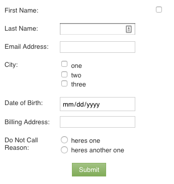
If you load that at a width greater than about 480px, it looks like this:
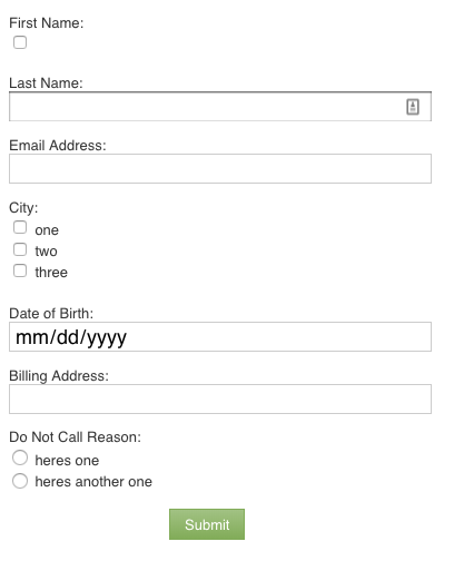
If you resize the browser to a width less than 480px WITHOUT refreshing the page, it goes responsive and looks like this, which is expected based upon default media queries set:
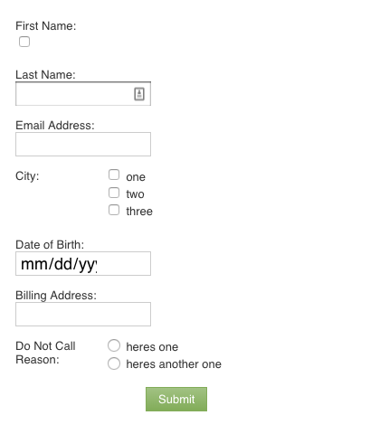
However, if you then refresh the page with the width less than 480px, the form doesn't look correct:
Inspecting the CSS shows that the input fields have a width of 150px set on them for some reason.
We can't really determine a good solution to this problem. The forms work in a standalone page, so we know that it's some combination of our setup combined with the form loading. What we'd really like is a way to completely turn off the mobile responsiveness of the forms and just always load them with the desktop version. I know that can be done with a whole mess of media queries but since it's our customers who will be embedding the forms, we can't expect them all to build their forms with that custom css included.
Anybody have any ideas as to what the problem might be and a possible solution?
Thanks!
- Labels:
-
Products
- Mark as New
- Bookmark
- Subscribe
- Mute
- Subscribe to RSS Feed
- Permalink
- Report Inappropriate Content
Hi Dan,
Your label for First Name has a hard width defined against it from the form editor (the same thing, incidentally, is happening on City/Do Not Call Reason which is causing issues on mobile.)
Use NormalizeMktoForms.css and remove the hard definitions on the labels to move to an actually responsive form.
- Mark as New
- Bookmark
- Subscribe
- Mute
- Subscribe to RSS Feed
- Permalink
- Report Inappropriate Content
Hey Courtney,
Thanks for the help. I got rid of the explicit widths and put in the css that you recommended. However, now the desktop version looks like the mobile version instead of what's in the form designer. You can see it here: preview.ceros.com/ceros-qa/marketo-1/page/page-5a663c524deda
Thanks again!
- Mark as New
- Bookmark
- Subscribe
- Mute
- Subscribe to RSS Feed
- Permalink
- Report Inappropriate Content
Hi Dan,
Top labels are usually my preference, but if you're looking to still have side labels for non-mobile views, you simply need to change line 1 of that CSS to
.mktoForm, .mktoForm .mktoFieldWrap, .mktoForm .mktoHtmlText {width:100% !important;}
and line 12 to
.mktoForm input[type=text], .mktoForm input[type=url], .mktoForm input[type=email], .mktoForm input[type=tel], .mktoForm input[type=number], .mktoForm input[type=date], .mktoForm textarea.mktoField, .mktoForm select.mktoField {padding: 0.3em; width: 60% !important;}
- Mark as New
- Bookmark
- Subscribe
- Mute
- Subscribe to RSS Feed
- Permalink
- Report Inappropriate Content
Thanks Courtney. Seems like that's about as close as we'll get without being able to just turn off the mobile responsiveness completely. Anyways, one last question. Do you know how likely it is that Marketo would change it's default styling and break that bit of css you've given me? It would be preferable if our customer's embedded forms didn't change style all of a sudden.
- Copyright © 2025 Adobe. All rights reserved.
- Privacy
- Community Guidelines
- Terms of use
- Do not sell my personal information
Adchoices


