Re: Form Customization - Help moving required asterisks in mobile
- Subscribe to RSS Feed
- Mark Topic as New
- Mark Topic as Read
- Float this Topic for Current User
- Bookmark
- Subscribe
- Printer Friendly Page
- Mark as New
- Bookmark
- Subscribe
- Mute
- Subscribe to RSS Feed
- Permalink
- Report Inappropriate Content
Hello -
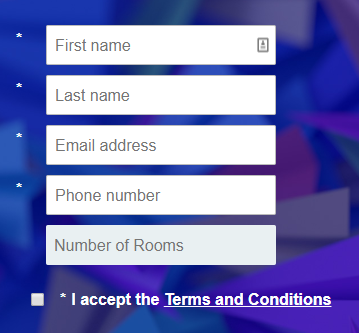
Having some difficulty moving the required asterisks in mobile to the left of the fields. I would like the asterisk to be positioned to the left of the input fields, however, it keeps moving above. I am sure it is a CSS issue, but I have been working on it now for too long and decided to reach out to the community for help! The page can be found here: mk.expedia.com/cutest.html
Let me know if anyone has ideas! Thanks,
- Karl
Solved! Go to Solution.
- Labels:
-
Products
- Mark as New
- Bookmark
- Subscribe
- Mute
- Subscribe to RSS Feed
- Permalink
- Report Inappropriate Content
Jim! I was able to fix it on my end but here's what I ended with:
}
@media only screen and (max-width: 480px) {
.mktoForm .mktoFormRow .mktoRequiredField .mktoAsterix {
margin-bottom: -27px !important; }
.mktoForm .mktoFormRow .mktoFormCol {
width: 350px !important;
}
.mktoForm .mktoFormCol .mktoLabel {
line-height: 2.0em !important;
}
}
Let me know if you have any other ideas though!
- Mark as New
- Bookmark
- Subscribe
- Mute
- Subscribe to RSS Feed
- Permalink
- Report Inappropriate Content
Hey Karl. They look left aligned to me when I resize to mobile. Can you post a screenshot of what you're seeing?
- Mark as New
- Bookmark
- Subscribe
- Mute
- Subscribe to RSS Feed
- Permalink
- Report Inappropriate Content
Jim! I was able to fix it on my end but here's what I ended with:
}
@media only screen and (max-width: 480px) {
.mktoForm .mktoFormRow .mktoRequiredField .mktoAsterix {
margin-bottom: -27px !important; }
.mktoForm .mktoFormRow .mktoFormCol {
width: 350px !important;
}
.mktoForm .mktoFormCol .mktoLabel {
line-height: 2.0em !important;
}
}
Let me know if you have any other ideas though!
- Copyright © 2025 Adobe. All rights reserved.
- Privacy
- Community Guidelines
- Terms of use
- Do not sell my personal information
Adchoices
