Email Template Outlook Bug - Rending Incorrectly
- Subscribe to RSS Feed
- Mark Topic as New
- Mark Topic as Read
- Float this Topic for Current User
- Bookmark
- Subscribe
- Printer Friendly Page
- Mark as New
- Bookmark
- Subscribe
- Mute
- Subscribe to RSS Feed
- Permalink
- Report Inappropriate Content
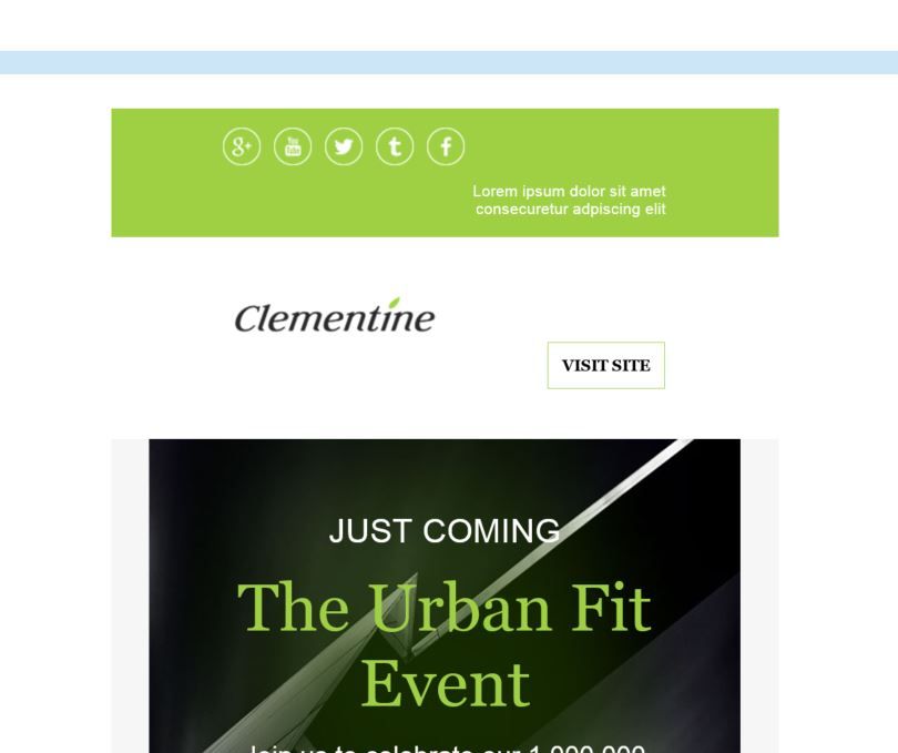
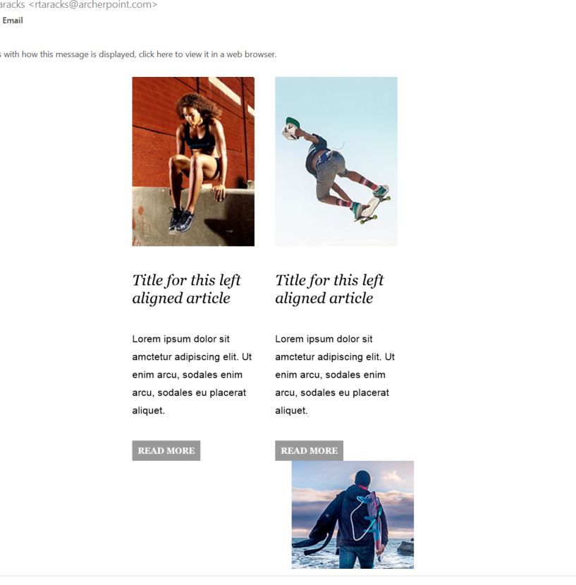
When testing some of the Marketo starter templates, they render incorrectly on some Windows PCs on Outlook.
They render at a much smaller width (almost mobile) even when opened full screen and have plenty of space.
Has anyone else run into this issue or have an idea on how to fix it?
See how the template Limon (completely unmodified) renders below.
- Mark as New
- Bookmark
- Subscribe
- Mute
- Subscribe to RSS Feed
- Permalink
- Report Inappropriate Content
Are you viewing these emails on a computer where your display settings are set to 125% or 150%? If so, special code is needed in the head; and the overall structure may need to be tweaked. See this thread for more info: Re: Marketo Removing Code for Image Scaling for Outlook at 125%dpi
- Mark as New
- Bookmark
- Subscribe
- Mute
- Subscribe to RSS Feed
- Permalink
- Report Inappropriate Content
They are at 100% but we will definitely want to implement this as I know a lot of high-res windows PCs are.
Thanks for the share Dan!
- Mark as New
- Bookmark
- Subscribe
- Mute
- Subscribe to RSS Feed
- Permalink
- Report Inappropriate Content
Marketo starter template have been really badly tested, they used Litmus to do most of the testing, which is fine for some things but physical testing is even more important. Limón is very similar to Iceberg and I've had lots of issues with that one on Outlook for PC, I spent around 20 hours of development from the out of the box version to get to my final version and the design didn't even change, it took that amount of time to get the bug fixes out of the way. The starter templates miss a few vital things Outlook requires too, i.e. background color should be in the body tag not the in table, as without this, we get a white border around the outer email in Outlook. Weird gaps appear between modules even know the design in Marketo has no gaps, I assume this is down to some Outlook padding or something.
Marketo also put lots of the links in variables, but these links don't come across to the Text Version, so I had to re-write so all links are in the template, a minor thing but something to consider.
- Mark as New
- Bookmark
- Subscribe
- Mute
- Subscribe to RSS Feed
- Permalink
- Report Inappropriate Content
Thanks for your insight Frank! We are most likely going to consider using Knak or another option.
- Copyright © 2025 Adobe. All rights reserved.
- Privacy
- Community Guidelines
- Terms of use
- Do not sell my personal information
Adchoices

