Editing form validation and error messages
- Subscribe to RSS Feed
- Mark Topic as New
- Mark Topic as Read
- Float this Topic for Current User
- Bookmark
- Subscribe
- Printer Friendly Page
- Mark as New
- Bookmark
- Subscribe
- Mute
- Subscribe to RSS Feed
- Permalink
- Report Inappropriate Content
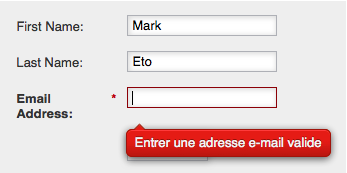
Is there a way I can change the CSS so that the yucky red box with white text doesn't appear when the error message appears?
I'd like to change it to my company's style guide. Please help!
Here is an example of the error message i'd like to change:
- Labels:
-
Email Marketing
- Mark as New
- Bookmark
- Subscribe
- Mute
- Subscribe to RSS Feed
- Permalink
- Report Inappropriate Content
The error messages are styled using the DIV.mktoError and descendent elements/classes.
- Mark as New
- Bookmark
- Subscribe
- Mute
- Subscribe to RSS Feed
- Permalink
- Report Inappropriate Content
Thanks Sanford Whiteman. After a lot of trial and error, I finally found a way of inserting only our own custom css without having to override Marketo styling defaults, but what I can't figure out is how to adjust the markup they produce.
For example, we have a custom select dropdown that depends on additional markup being added for the 'down arrow.' How would would we go about making sure select fields can include that additional markup?
- Mark as New
- Bookmark
- Subscribe
- Mute
- Subscribe to RSS Feed
- Permalink
- Report Inappropriate Content
You can manipulate the form HTML -- with some significant limitations -- in MktoForms2.whenRendered (if you're using Visibility Rules) or MktoForms2.whenReady (for simpler forms).
But at a certain point, if you're not familiar with the tricks of this particular trade, you should cut your losses and use an entirely custom form, then use the Forms 2 API to submit it: Make a Marketo Form Submission in the background
- Copyright © 2025 Adobe. All rights reserved.
- Privacy
- Community Guidelines
- Terms of use
- Do not sell my personal information
Adchoices
