Checkboxes (again) Display on Mobile
- Subscribe to RSS Feed
- Mark Topic as New
- Mark Topic as Read
- Float this Topic for Current User
- Bookmark
- Subscribe
- Printer Friendly Page
- Mark as New
- Bookmark
- Subscribe
- Mute
- Subscribe to RSS Feed
- Permalink
- Report Inappropriate Content
@Sanford_Whitem2 @Dave_Roberts
I am so close (yet so far away) on getting this form to display the checkboxes properly on mobile.
engage.livelyme.com/preference-center-jennifer.html
I am dying to get this project completed this week. Marketo really is tricky (ie: painful) to work with due to the convoluted workflows and I tagged both of you because I know you know EVERY trick in the book.
Thanks in advance
Solved! Go to Solution.
- Labels:
-
checkboxes
-
forms
-
landing page templates
- Mark as New
- Bookmark
- Subscribe
- Mute
- Subscribe to RSS Feed
- Permalink
- Report Inappropriate Content
Hey Jen, thanks for thinking about me for this one.
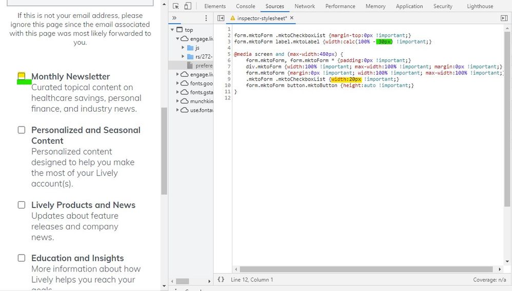
I think the issue you're running into here is that you've got the labels styled to be 90% of the width and when you get down to mobile that ends up being too wide for the 20px checkboxes to display on the same line. Rather than setting the width of the labels to 90%, you can set them to "100% minus the width of the checkbox plus some padding between them" using the "calc()" css property. I've attached some code below that I used in the inspector to work this out on mobile. The top two styles just align the checkbox to the top of the field (in line w/ the labels) and the 2nd line is the calc() css that resizes the labels to account for the checkbox width (20px) plus a little gap (10px).
Under that are styles in a media query aimed at anything less than 480px. This CSS should go at the end of your stylesheet or at the end of the Custom CSS on the form if that's where you're styling it. The idea is we want these styles to override anything else on the stylesheet when you're looking at a mobile device.
Try adding in this CSS:
form.mktoForm .mktoCheckboxList {margin-top:0px !important;}
form.mktoForm label.mktoLabel {width:calc(100% - 30px) !important;}

@media screen and (max-width:480px) {
    form.mktoForm, form.mktoForm * {padding:0px !important;}
    div.mktoForm {width:100% !important; max-width:100% !important; margin:0px !important;}
    form.mktoForm {margin:0px !important; width:100% !important; max-width:100% !important;}
    .mktoForm .mktoCheckboxList {width:20px !important;}
    form.mktoForm button.mktoButton {height:auto !important;}
}
... and see if you end up getting something more like this...

... or let me know if you've got any questions or it doesn't come out that way on your end.
- Mark as New
- Bookmark
- Subscribe
- Mute
- Subscribe to RSS Feed
- Permalink
- Report Inappropriate Content
Hey Jen, thanks for thinking about me for this one.
I think the issue you're running into here is that you've got the labels styled to be 90% of the width and when you get down to mobile that ends up being too wide for the 20px checkboxes to display on the same line. Rather than setting the width of the labels to 90%, you can set them to "100% minus the width of the checkbox plus some padding between them" using the "calc()" css property. I've attached some code below that I used in the inspector to work this out on mobile. The top two styles just align the checkbox to the top of the field (in line w/ the labels) and the 2nd line is the calc() css that resizes the labels to account for the checkbox width (20px) plus a little gap (10px).
Under that are styles in a media query aimed at anything less than 480px. This CSS should go at the end of your stylesheet or at the end of the Custom CSS on the form if that's where you're styling it. The idea is we want these styles to override anything else on the stylesheet when you're looking at a mobile device.
Try adding in this CSS:
form.mktoForm .mktoCheckboxList {margin-top:0px !important;}
form.mktoForm label.mktoLabel {width:calc(100% - 30px) !important;}

@media screen and (max-width:480px) {
    form.mktoForm, form.mktoForm * {padding:0px !important;}
    div.mktoForm {width:100% !important; max-width:100% !important; margin:0px !important;}
    form.mktoForm {margin:0px !important; width:100% !important; max-width:100% !important;}
    .mktoForm .mktoCheckboxList {width:20px !important;}
    form.mktoForm button.mktoButton {height:auto !important;}
}
... and see if you end up getting something more like this...

... or let me know if you've got any questions or it doesn't come out that way on your end.
- Mark as New
- Bookmark
- Subscribe
- Mute
- Subscribe to RSS Feed
- Permalink
- Report Inappropriate Content
@Dave_Roberts Amazing! Working like a charm now - thank you!
Perhaps you have an answer to the next issue I need to tackle...
This LP is a email list preference center. When a user arrives and they are already subscribed to a list (or 3) they will see checkboxes next to the list(s) they are subbed to. When they check unsubscribe all then all of the boxes above should become unchecked. Is this something I need to configure on the HTML, CSS, JS side or is it a form directive?
Thank you again - you made my week and I feel like my burdens today are lifted because of all of your help on this and the other posts you answered of mine.
- Mark as New
- Bookmark
- Subscribe
- Mute
- Subscribe to RSS Feed
- Permalink
- Report Inappropriate Content
When a user arrives and they are already subscribed to a list (or 3) they will see checkboxes next to the list(s) they are subbed to.
You should be able to tick the "prefill" box on each field in the field editor to get the fields to prepopulate when a known user navigates to your Pref Center from a Marketo email or a tracked Marketo link from an LP.
Is this something I need to configure on the HTML, CSS, JS side or is it a form directive?
The way I've usually handled this is to write some JS to handle the check/uncheck all behavior and then add that JS to the template below the form. As with most things, a quick search of the community turns up an article Sanford posted with some help on the check/uncheck all situation here: https://nation.marketo.com/t5/Product-Discussions/Marketo-Form-Uncheck-other-checkboxes-when-Unsubsc...
- Copyright © 2025 Adobe. All rights reserved.
- Privacy
- Community Guidelines
- Terms of use
- Do not sell my personal information
Adchoices