Asterisk Placement
- Subscribe to RSS Feed
- Mark Topic as New
- Mark Topic as Read
- Float this Topic for Current User
- Bookmark
- Subscribe
- Printer Friendly Page
- Mark as New
- Bookmark
- Subscribe
- Mute
- Subscribe to RSS Feed
- Permalink
- Report Inappropriate Content
Hi,
I'm trying to move the placement of an Asterisk to be after a field instead of before it. Does anyone have any css code for this?
I tried using the below code which I found in this thread:
Change the placement of the required field asterisk?
.mktoRequiredField .mktoAsterix:after {
content:" *";
}
Unfortunately all it did is add a second asterisk directly next to the one's already there to the left of the field
Solved! Go to Solution.
- Mark as New
- Bookmark
- Subscribe
- Mute
- Subscribe to RSS Feed
- Permalink
- Report Inappropriate Content
This worked for me:
.mktoForm .mktoAsterix {position: absolute; right: -11px;}
- Mark as New
- Bookmark
- Subscribe
- Mute
- Subscribe to RSS Feed
- Permalink
- Report Inappropriate Content
This worked for me:
.mktoForm .mktoAsterix {position: absolute; right: -11px;}
- Mark as New
- Bookmark
- Subscribe
- Mute
- Subscribe to RSS Feed
- Permalink
- Report Inappropriate Content
That probably won't look good on different devices. Absolute positioning is not generally the best way to implement things.
- Mark as New
- Bookmark
- Subscribe
- Mute
- Subscribe to RSS Feed
- Permalink
- Report Inappropriate Content
Try something such as :
.mktoRequiredField .mktoAsterix {
float:right;
text-align : left;
}
- Mark as New
- Bookmark
- Subscribe
- Mute
- Subscribe to RSS Feed
- Permalink
- Report Inappropriate Content
Tried it, but it didn't work.....
- Mark as New
- Bookmark
- Subscribe
- Mute
- Subscribe to RSS Feed
- Permalink
- Report Inappropriate Content
Unless you are using a destyled form, I would leave the existing asterisk in place because it affects layout in subtle ways. Instead, just hide it and make a copy on the other side: MktoForms2 :: Asterisk on Right.
- Mark as New
- Bookmark
- Subscribe
- Mute
- Subscribe to RSS Feed
- Permalink
- Report Inappropriate Content
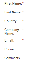
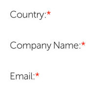
Thanks. the request unfortunately has since changed. I've seen you answering some css questions on other threads. Do you know how to place the asterisk directly to the right of each field?
I've currently got it to look like this using: .mktoForm .mktoAsterix {position: relative; left: -22px;}
But I'm trying to get it to look like this: with the Asterisk next to each individual field:
- Mark as New
- Bookmark
- Subscribe
- Mute
- Subscribe to RSS Feed
- Permalink
- Report Inappropriate Content
You can do that directly in the Form Editor itself.
Go in and click on a label. On the right pane it will say Label Width and Field Width. Make the Label Width as small as possible for each field so that the asterisk is right next to the label. It's easier then if you want to change how far away the text boxes are...
- Mark as New
- Bookmark
- Subscribe
- Mute
- Subscribe to RSS Feed
- Permalink
- Report Inappropriate Content
Yeah I suppose you could do that: but then your fields will move too. This would leave you with a set of fields that are not in line.
- Copyright © 2025 Adobe. All rights reserved.
- Privacy
- Community Guidelines
- Terms of use
- Do not sell my personal information
Adchoices

