Hey Callum,
Thanks for the reminder here, I was able to see the form on the links you shared.
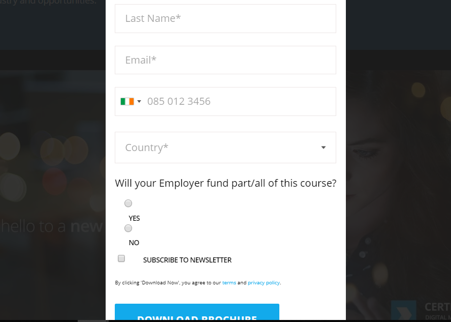
I've gone into the inspector to add a few styles to the page so you could see what this should look like once it's in place. The CSS below should be able to be copied and pasted into either A) the form's Custom CSS in the form editor (for local application, this form only) -or- B) into your site's stylesheet for a more global application (for all forms on pages that use this stylesheet).

form.mktoForm fieldset .mktoFormRow .mktoRadioList {
display:-webkit-box !important;
display:-ms-flexbox !important;
display:flex !important;
padding-top:10px;
}
form.mktoForm fieldset .mktoFormRow .mktoRadioList input {
width:auto !important;
margin-right:0px !important;
}
form.mktoForm fieldset .mktoFormRow .mktoRadioList label {
margin-left:10px !important;
margin-right:30px !important;
}
I've added a few inline comments to the CSS to help make sense of the controls, let me know if you've got any questions on any of that. Any of the comments can be removed for production if you're more comfortable with that.
The 1st set of rules (line 1-6): This displays the radio list as a "flexbox" which basically means it runs left-to-right (like a row) instead of a column. The default "flex-direction" for the "dislpay:flex;" property is "row" - to get flex'd items to run top-to-bottom you'd use "flex-direction: column;" instead. There is a little padding added to the top of the radio list element to create some space between the main label and the radio fields.
The 2nd set of rules (line 7-11): The radio buttons (inputs) get their width adjusted to "auto" and I've overridden the right margin on the inputs. That spacing is moved into the labels so it's easier to manage (it's in one place instead of two)
The 3rd set of rules (line 12-16): The labels (YES, NO) have spacing to the left and right provided by the margins here. You can adjust these as you see fit, there are comments inline to point out where the space for each is.
Try adding these styles in and let me know if that worked for you, if not, Im happy to take another look.
 Adchoices