Re: 2.0 Forms: are the following change possible?
- Subscribe to RSS Feed
- Mark Topic as New
- Mark Topic as Read
- Float this Topic for Current User
- Bookmark
- Subscribe
- Printer Friendly Page
- Mark as New
- Bookmark
- Subscribe
- Mute
- Subscribe to RSS Feed
- Permalink
- Report Inappropriate Content
Hello,
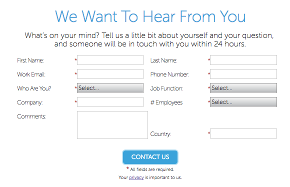
I have received the following mock-up:
Which I have tried to recreate via a 2.0 form
https://info.talend.com/TLD_EN_Y16Q01_RequestInfo_Pricing_LP-Registration-Horizontal.html
As you can see I am running into a series of issues:
- I cannot move the submit button under the middle colum
- the text area on the right column is creating an extra gap between the Email Address and the Phone field
- I have a visibility rule for Industry. If a person is based in the US, they should see State. However I am not able to move State just under Industry as there is no associated field on the left column (below Company)
- I don't know how to make it possible that when the user tabs through the UX, the cursor move horizontally through the fields...
Is it possible to solve the above issues? Do I need to add custom CSS? If yes, how should I proceed giving fact that I have no CSS knowledge...
Thanks for your help.
Cécile
- Mark as New
- Bookmark
- Subscribe
- Mute
- Subscribe to RSS Feed
- Permalink
- Report Inappropriate Content
yeah, I think this could be done - even responsive. apply custom CSS to the form columns and form rows that Marketo wraps around the fields.
Use a one column layout in the editor or at least have the larger comment field in an extra row and try to make the rows inline-block elements. it will need quite some fiddling around I guess.
- Mark as New
- Bookmark
- Subscribe
- Mute
- Subscribe to RSS Feed
- Permalink
- Report Inappropriate Content
Hi Cecile Maindron
I am interested in this post.
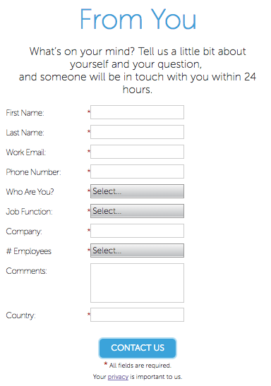
Marketo 'Contact Us' form is similar to yours.
It builded with forms2, and it has center button.
Unfortunately, i investigated this source (HTML, JS and CSS), but I could not understand this technique.
Additionally this form is responsible.
good-luck
- Mark as New
- Bookmark
- Subscribe
- Mute
- Subscribe to RSS Feed
- Permalink
- Report Inappropriate Content
Something significantly different between Cecile's mockup and the other example: the latter doesn't have any fields that span multiple rows. That "How may we help you" textarea is the reason you must refloat the fields manually to get what Cecile wants.
The centered Submit button was always the easy part. That uses .mktoButtonRow { text-align: center !important; }.
- Mark as New
- Bookmark
- Subscribe
- Mute
- Subscribe to RSS Feed
- Permalink
- Report Inappropriate Content
This isn't that difficult, although for this you shouldn't try to build the column layout at all in the editor. Instead, have every field in its own row, then use CSS to do all the floating and positioning.
But I worry that people are giving you mockups knowing you have no CSS knowledge. It's not a sustainable situation: even though I'm saying it's generally simple and someone on the forums can give you a big leg up, that doesn't include browser-specific adjustments for pixel (near) perfection, nor like Jenn said does it include maintenance over time.
- Mark as New
- Bookmark
- Subscribe
- Mute
- Subscribe to RSS Feed
- Permalink
- Report Inappropriate Content
How often will you need to update the form in the future?
I feel like the quickest (but most down-and-dirty) way to accomplish this may be best done by using straight-up HTML and CSS (ie: copying and pasting the form HTML, making some design edits to close the gaps, and styling it on the page). You'd have to work with someone to do that for you in this circumstance, and it would all be hard-coded so future updates wouldn't be straightforward, unfortunately. So not the greatest solution, but it works.
I'm sure it can also be done using only custom CSS, but I'm not sure it would be very "clean". Perhaps someone else has more insight?
- Copyright © 2025 Adobe. All rights reserved.
- Privacy
- Community Guidelines
- Terms of use
- Do not sell my personal information
Adchoices


