- Marketing Nation
- :
- Products
- :
- Ideas
- :
- Ideas
- :
- Revenue Cycle Model Flow Graph
Your Achievements
Next /
Sign inSign in to Community to gain points, level up, and earn exciting badges like the new Applaud 5 BadgeLearn more!
View All BadgesSign in to view all badges
Revenue Cycle Model Flow Graph
Idea Options
- Subscribe to RSS Feed
- Mark as New
- Mark as Read
- Bookmark
- Subscribe
- Printer Friendly Page
- Report Inappropriate Content
- Mark as New
- Bookmark
- Subscribe
- Mute
- Subscribe to RSS Feed
- Permalink
- Report Inappropriate Content
Revenue Cycle Model Flow Graph
Status:
Open Ideas
Submitted by
Anonymous
on
02-07-2013
06:01 AM
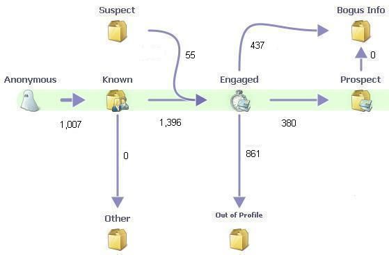
I manually create a visual representation of the flow through the transitions of our revenue model each quarter. Please add the ability to generate a graph for various time periods similar to the screen shot below. Also include the ability to filter the results using a smart list (e.g. member of program), so that we can visualize see the impact of certain programs, lead source, etc.


- Find more ideas tagged with:
- revenue cycle analytics
673
2 Comments
You must be a registered user to add a comment. If you've already registered, sign in. Otherwise, register and sign in.
- Copyright © 2025 Adobe. All rights reserved.
- Privacy
- Terms of use
- Do not sell my personal information
Adchoices

.png)