- Marketing Nation
- :
- Products
- :
- Ideas
- :
- Ideas
- :
Your Achievements
Next /
Sign inSign in to Community to gain points, level up, and earn exciting badges like the new Applaud 5 BadgeLearn more!
View All BadgesSign in to view all badges
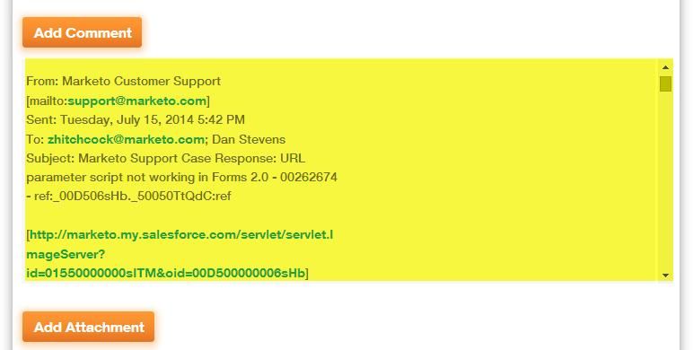
Please provide a more usable window/frame for the Support comments/thread
Idea Options
- Subscribe to RSS Feed
- Mark as New
- Mark as Read
- Bookmark
- Subscribe
- Printer Friendly Page
- Report Inappropriate Content
- Mark as New
- Bookmark
- Subscribe
- Mute
- Subscribe to RSS Feed
- Permalink
- Report Inappropriate Content
Please provide a more usable window/frame for the Support comments/thread
Status:
Under review
Submitted by
 Dan_Stevens_
on
07-16-2014
02:38 PM
Many of our support tickets include back and forth discussions that are captured in the comments section of the support ticket. Most of the time, we reply directly via email and this unfortunately includes the entire email message. We're trying to remember to only include our comments here. But regardless, when the thread gets extensive, it's very difficult to view the thread in such a small window/frame.


- Find more ideas tagged with:
- support
2,253
5 Comments
You must be a registered user to add a comment. If you've already registered, sign in. Otherwise, register and sign in.
- Copyright © 2025 Adobe. All rights reserved.
- Privacy
- Community Guidelines
- Terms of use
- Do not sell my personal information
Adchoices