Missing items in my mobile landing page
- Subscribe to RSS Feed
- Mark Topic as New
- Mark Topic as Read
- Float this Topic for Current User
- Bookmark
- Subscribe
- Printer Friendly Page
- Mark as New
- Bookmark
- Subscribe
- Mute
- Subscribe to RSS Feed
- Permalink
- Report Inappropriate Content
I'm not technical and I don't have in house resources, so I hope someone can help! I'm creating my email preference center and my mobile version looks really different from my template - most notably (aside from bgcolor) that nothing comes over onto mobile: no footer, logo image or anything except my form. Here's the page: InTouch Health - check it out on your phone.
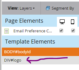
I'm guessing I need to make parts of the template editable like in my emails for them to show up, but when I tried making the logo (check out my code below) mkteditbale I can now see the logo in page elements, but it doesn't give me the option to check mobile like it does my form (which is under page elements). Can anyone help me figure out what I'm doing wrong?
<body>
<div id="page">
<div id="sidebar">
<div class="top-box"></div>
<div class="site-branding">
<a href="intouchhealth.com/" rel="home">
<div id="logo" class="mktEditable">
<img src="iacademy.intouchhealth.com/wp-content/themes/academy/ith-logo.png" alt="InTouch Health">
</div>
</a>
</div>
<nav class="widget-area">
<a href="intouchhealth.com/telehealth-resources/">Telehealth Resources</a>
<a href="intouchhealth.com/contact/">Contact</a>
</nav>
</div>
<div class="content">
Solved! Go to Solution.
- Mark as New
- Bookmark
- Subscribe
- Mute
- Subscribe to RSS Feed
- Permalink
- Report Inappropriate Content
Hi Christina,
The first important question for us to understand what's happening is: are you using a free form template or a guided template ?
The 2 technologies are very different in term of how they support mobile versions and also about editable regions.
On guided, (i.e. truely responsive) you have editable elements and variables and basically, the difference between the mobile and the desktop is managed by CSS.
On free form, positioning is absolute and you can drag and drop elements as you want and where you want on the desktop version, but on mobile, the element will just show one beneath the other. You have the option to select some elements to display only on desktop, only on mobile or on both (the default).
-Greg
- Mark as New
- Bookmark
- Subscribe
- Mute
- Subscribe to RSS Feed
- Permalink
- Report Inappropriate Content
You are using a free-form landing page, so when you activate the mobile version, the only content that will appear are the Editable Elements you dragged on via the LP editor. No template elements will appear. Our docs should describe how this all works if you do a quick search
- Mark as New
- Bookmark
- Subscribe
- Mute
- Subscribe to RSS Feed
- Permalink
- Report Inappropriate Content
Hi Christina,
The first important question for us to understand what's happening is: are you using a free form template or a guided template ?
The 2 technologies are very different in term of how they support mobile versions and also about editable regions.
On guided, (i.e. truely responsive) you have editable elements and variables and basically, the difference between the mobile and the desktop is managed by CSS.
On free form, positioning is absolute and you can drag and drop elements as you want and where you want on the desktop version, but on mobile, the element will just show one beneath the other. You have the option to select some elements to display only on desktop, only on mobile or on both (the default).
-Greg
- Mark as New
- Bookmark
- Subscribe
- Mute
- Subscribe to RSS Feed
- Permalink
- Report Inappropriate Content
I see. Yes, I'm using free form landing page. In that case, that makes sense. Thank you for clarifying!
Since this is a one time use form / landing page for subscription center, I'm fine with mobile looking the way it does, except I'd like the background to change to white instead of that ugly brown color. I have no idea where that color came from. Any ideas Grégoire Michel or Justin Cooperman?
- Mark as New
- Bookmark
- Subscribe
- Mute
- Subscribe to RSS Feed
- Permalink
- Report Inappropriate Content
The mobile bg color is inherited from the bg color of the <body> element in your template. You can change it by clicking on it when in the "Mobile" tab.
- Mark as New
- Bookmark
- Subscribe
- Mute
- Subscribe to RSS Feed
- Permalink
- Report Inappropriate Content
Fixed it! Thank you Grégoire Michel and Justin Cooperman for all of your help! Hope to see you both at Summit.
- Copyright © 2025 Adobe. All rights reserved.
- Privacy
- Community Guidelines
- Terms of use
- Do not sell my personal information
Adchoices
