Your Achievements
Next /
Sign inSign in to Community to gain points, level up, and earn exciting badges like the new Applaud 5 BadgeLearn more!
View All BadgesSign in to view all badges
SOLVED
line breaks in mobile responsive templates
Go to solution
Topic Options
- Subscribe to RSS Feed
- Mark Topic as New
- Mark Topic as Read
- Float this Topic for Current User
- Bookmark
- Subscribe
- Printer Friendly Page
Anonymous
Not applicable
01-05-2015
12:50 PM
- Mark as New
- Bookmark
- Subscribe
- Mute
- Subscribe to RSS Feed
- Permalink
- Report Inappropriate Content
01-05-2015
12:50 PM
I used one of the Marketo mobile responsive email templates for a recent trigger campaign (anniversary email).
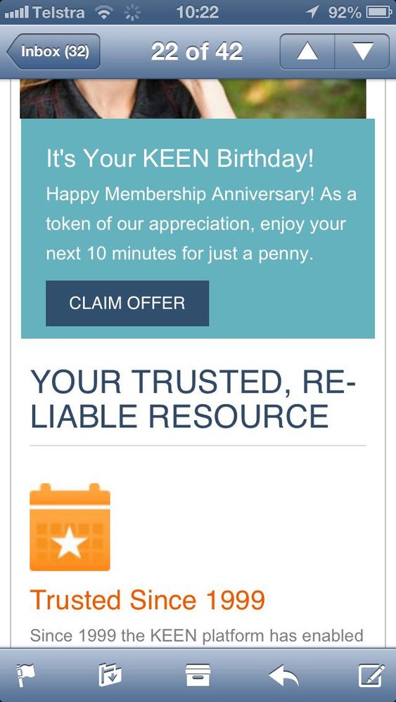
I notice that when I view the emails on mobile the copy in the headline will often extend to a second line, with the word at the end of the top line broken up with a hyphen (see "Reliable" copy in bottom half of screen shot below).
Would appreciate advice ensuring that the copy doesn't wrap like this.
Thanks!!
Geoff

Solved! Go to Solution.
Labels:
- Labels:
-
Lead Management
1 ACCEPTED SOLUTION
- Mark as New
- Bookmark
- Subscribe
- Mute
- Subscribe to RSS Feed
- Permalink
- Report Inappropriate Content
01-05-2015
02:10 PM
You should be able to control this with the CSS, though it will probably take an effort across different email clients. I'd start here and look at { hyphens: } in particular. https://kenneth.io/blog/2012/03/04/word-wrapping-hypernation-using-css/
2 REPLIES 2
- Mark as New
- Bookmark
- Subscribe
- Mute
- Subscribe to RSS Feed
- Permalink
- Report Inappropriate Content
05-16-2015
10:12 AM
Hey Geoff,
If you don't want to mess around with HTML and CSS anymore, check out www.knak.io.
Will give you all the code for responsive templates that has been tested in Litmus, and you can just worry about editing it in the Marketo WYSIWYG editor.
- Mark as New
- Bookmark
- Subscribe
- Mute
- Subscribe to RSS Feed
- Permalink
- Report Inappropriate Content
01-05-2015
02:10 PM
You should be able to control this with the CSS, though it will probably take an effort across different email clients. I'd start here and look at { hyphens: } in particular. https://kenneth.io/blog/2012/03/04/word-wrapping-hypernation-using-css/
- Copyright © 2025 Adobe. All rights reserved.
- Privacy
- Community Guidelines
- Terms of use
- Do not sell my personal information
Adchoices