Your Achievements
Next /
Sign inSign in to Community to gain points, level up, and earn exciting badges like the new Applaud 5 BadgeLearn more!
View All BadgesSign in to view all badges
SOLVED
Get Rid of Extra Padding in Form Fields - Desktop View
Go to solution
Topic Options
- Subscribe to RSS Feed
- Mark Topic as New
- Mark Topic as Read
- Float this Topic for Current User
- Bookmark
- Subscribe
- Printer Friendly Page
Anonymous
Not applicable
09-15-2014
10:26 AM
- Mark as New
- Bookmark
- Subscribe
- Mute
- Subscribe to RSS Feed
- Permalink
- Report Inappropriate Content
09-15-2014
10:26 AM
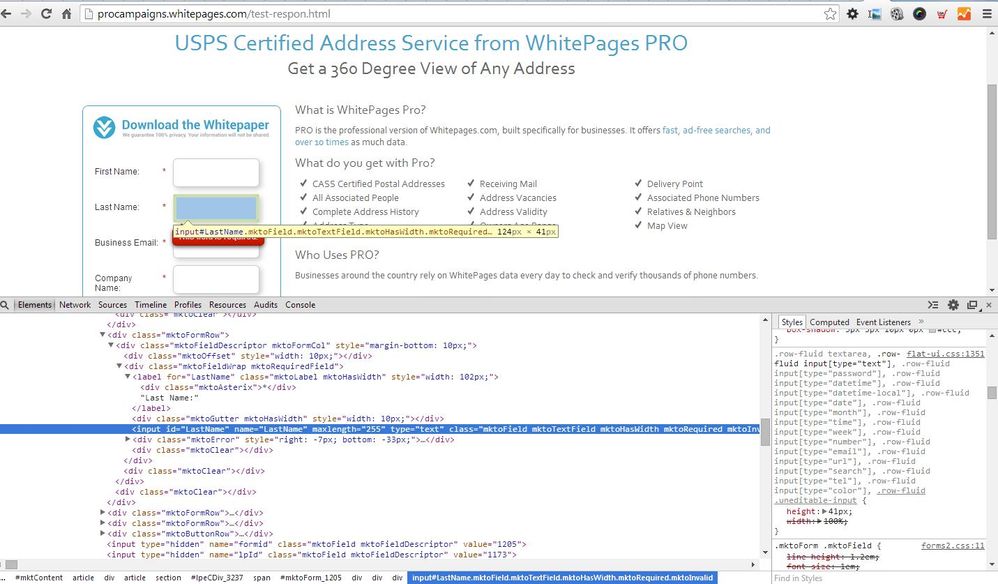
I've created a form. When I view it on a mobile device the field heights look fine. However, when I view it on a desktop there is excess padding/height for the form fields on all browsers - IE, Chrome, Firefox.
I've tried to edit the CSS of the form directly by adding custom CSS, as well as update it directly on the landing page via CSS styles in the header and in a separate style sheet. These change the heights on the mobile version, but not the desktop version.
What is controling the height of the form field in larger browser media widths?!
Example Page: http://procampaigns.whitepages.com/test-respon.html
Custom CSS on the Form Itself AND Style Sheet updates I'm using:
.mktoForm input[type=text],
.mktoForm input[type=url],
.mktoForm input[type=email],
.mktoForm input[type=tel],
.mktoForm input[type=number],
.mktoForm input[type=date],
.mktoForm select.mktoField,
.mktoForm textarea.mktoField {
-webkit-appearance: none;
background-color:#fff;
line-height:.6em !important;
font-weight: normal;
color:#000;
padding:4px !important;
/*border:1px solid #aeb0b6;
/*border:1px solid #aeb0b6;
box-shadow: 3px 3px 10px 0px #ccc;*/
}
fieldset, form, label, legend {
margin: 0;
padding: 0 !important;
line-height: .6em !important;
border: 0;
}
form input.mktFormText,
.mktoForm .mktoTextField,
.mktoForm .mktoUrlField,
.mktoForm .mktoTelField,
.mktoForm .mktoEmailField {
/*background: #fff;
border: 1px solid #b6b6b6;
box-shadow: none;*/
font-size: .9rem !important;
padding: 4px !important;
line-height: .6em !important;
/*width: 100%;*/
}
Form Field Heights - Mobile Browser:
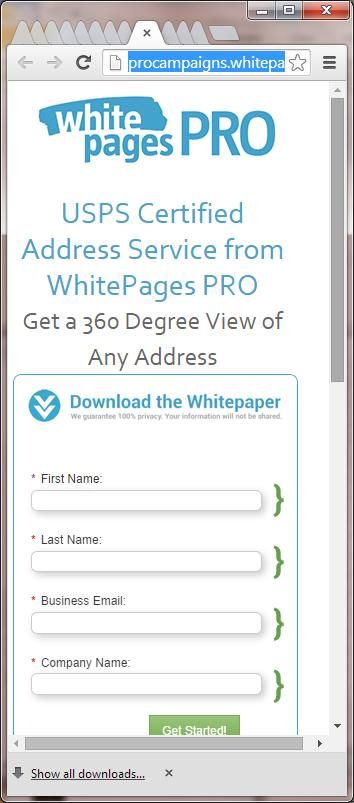
Desktop Form Field Heights

Form Field Heights - Mobile Browser:

Desktop Form Field Heights

Solved! Go to Solution.
Labels:
- Labels:
-
Lead Management
1 ACCEPTED SOLUTION
Anonymous
Not applicable
09-15-2014
12:39 PM
- Mark as New
- Bookmark
- Subscribe
- Mute
- Subscribe to RSS Feed
- Permalink
- Report Inappropriate Content
09-15-2014
12:39 PM
What if you add this as a local Custom HTML element in the Landing Page Editor - and hardcode the height of the form fields?
<style type="text/css" >
.mktoField {
height: 35px;
}
</style>
.mktoField {
height: 35px;
}
</style>
3 REPLIES 3
Anonymous
Not applicable
09-16-2014
04:43 PM
- Mark as New
- Bookmark
- Subscribe
- Mute
- Subscribe to RSS Feed
- Permalink
- Report Inappropriate Content
09-16-2014
04:43 PM
Kyle, the hard-coded style worked. Thanks!
- Mark as New
- Bookmark
- Subscribe
- Mute
- Subscribe to RSS Feed
- Permalink
- Report Inappropriate Content
09-15-2014
12:45 PM
I can see that its 41px in height, this is coming from your Marketo form CSS. Are you able to add custom CSS?

Anonymous
Not applicable
09-15-2014
12:39 PM
- Mark as New
- Bookmark
- Subscribe
- Mute
- Subscribe to RSS Feed
- Permalink
- Report Inappropriate Content
09-15-2014
12:39 PM
What if you add this as a local Custom HTML element in the Landing Page Editor - and hardcode the height of the form fields?
<style type="text/css" >
.mktoField {
height: 35px;
}
</style>
.mktoField {
height: 35px;
}
</style>
- Copyright © 2025 Adobe. All rights reserved.
- Privacy
- Community Guidelines
- Terms of use
- Do not sell my personal information
Adchoices