- Marketing Nation
- :
- Products
- :
- Blogs
- :
- Employee Blogs
- :
Understand your Marketing Technology and Data: Create this Architecture Diagram
- Subscribe to RSS Feed
- Mark as New
- Mark as Read
- Bookmark
- Subscribe
- Printer Friendly Page
- Report Inappropriate Content
- Mark as New
- Bookmark
- Subscribe
- Mute
- Subscribe to RSS Feed
- Permalink
- Report Inappropriate Content
Last updated date: Aug 29th, 2023
**Posted on behalf of Kelly Jo Horton @KellyJo_Horton, Senior Client Partner, Etumos.**
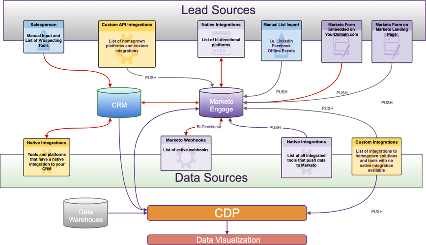
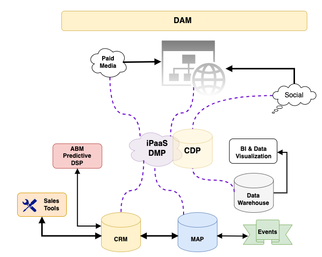
Many of you have seen my Lead and Data Flow diagrams and asked me for editable versions. I am finally getting around to making the diagrams available for anyone who is interested. This is the first lead and data source diagram I ever created. The marketing technology landscape has exploded since then!
This diagram was born out of necessity when I started a new job where I was responsible for cleaning up and maintaining a Marketo Engage instance that had been around for many years and had many cooks in the kitchen. After a quick audit of the instance, I decided to tackle the issue of the thousands of API errors I was seeing daily. I asked for an architecture diagram, so I could see all of the lead and data sources that could potentially be causing the errors, and one didn’t exist. So, I created one.
Creating this architecture diagram has so many benefits:
-
If you’re new to a company this forces you to get to know your key stakeholders and find out who is responsible for any platform that is integrated with Marketo Engage, and who is responsible for any external sources sending data or activities to Marketo Engage via the REST API. *NOTE: You can find a list of API users in the Integration>LaunchPoint tab in the Marketo Engage admin dashboard. You can find API usage statistics by API user in the Integration>Web Services tab in the API Call Information section. Click on the API call number to see the individual calls by user.
-
It’s a great way to familiarize yourself with whatever new data universe you just inherited. I find that mapping everything out really helps me evaluate and troubleshoot the current state of the tech stack.
-
It’s a great way to learn the marketing and sales processes and understand the lead lifecycle.
This first diagram was critical to me being able to troubleshoot the thousands of API errors I was seeing every day.
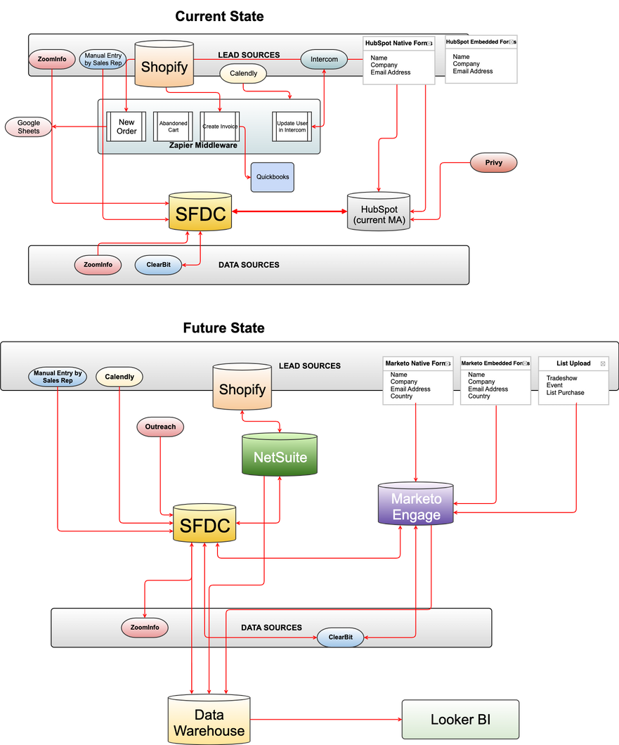
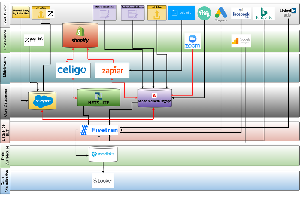
I have continued this tradition in my subsequent roles, using diagrams like this as a visual roadmap for my key stakeholders. I encourage clients to create them and publish them in a common place, where other stakeholders can comment and suggest additions or corrections. I encourage people to create a “Current State” diagram and a “Future State” diagram that can be used when presenting the technology and systems roadmap to non-technical stakeholders. I also keep a technical version that shows details like the API username for each integration, a short description of the type of data being pushed to Marketo Engage or pulled from Marketo Engage, and a detailed diagram of any middleware flows and triggers. Here are a few recent examples.
-
Current State, Future State:
- Detailed layers by functional category:
-
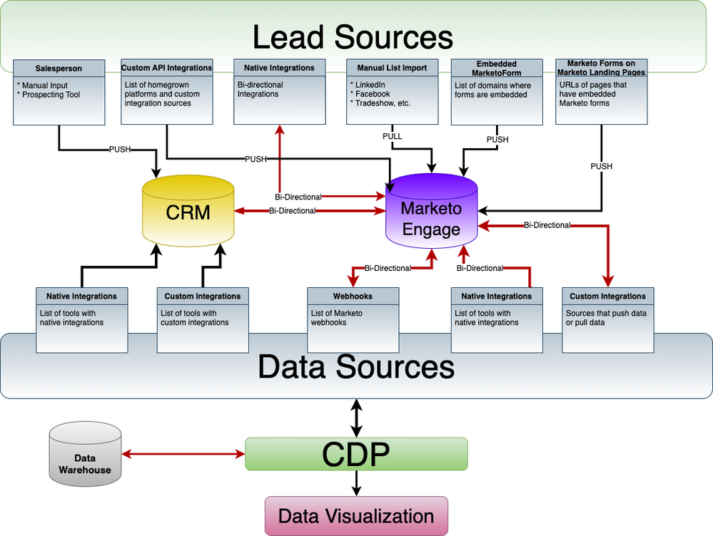
Basic Lead and Data Source Flow:
- Simplified Diagram
This is a great exercise for a new Marketing Operation Manager/Platform Operations Manager. Even if this diagram already exists, have them start from scratch and create a new one. The newbie may have a different perspective!
I have created different versions of my diagrams in various formats. You can create your own diagrams in draw.io (Google Docs), Adobe XD, Figma, or Gliffy (in Confluence), just to name a few. Most of these tools can import multiple file formats, so hopefully one of these will work for you.
Next Steps
Ready to get to know your key stakeholders, and get to know your technology ecosystem? Just follow the steps below.
- Make a list of every Marketo Engage platform integration you are aware of.
- Do some sleuthing to identify the functional owner of each platform and keep a spreadsheet with platform admin names, contact info, contract owner, and any other pertinent information.
- Set up a discovery session with each platform owner to document the integration details.
- Download one of the sample data flow diagrams to map out the current state of your tech stack, lead, and data flow, or create your own from scratch. I find it helpful to draw it out on a whiteboard first.
- Document the ideal state of the technology and systems roadmap by creating a "future state" diagram.
Your Turn
Once you have that first diagram under your belt, pay it forward. Share your diagram with your co-workers and other industry colleagues and teach someone else the process. Feel free to share your diagram or questions with us in the comments section.
You must be a registered user to add a comment. If you've already registered, sign in. Otherwise, register and sign in.
- Copyright © 2025 Adobe. All rights reserved.
- Privacy
- Community Guidelines
- Terms of use
- Do not sell my personal information
Adchoices
