- Marketing Nation
- :
- Products
- :
- Ideas
- :
- Ideas
- :
Your Achievements
Next /
Sign inSign in to Community to gain points, level up, and earn exciting badges like the new Applaud 5 BadgeLearn more!
View All BadgesSign in to view all badges
Contrast in email selection in email performance report setup
Idea Options
- Subscribe to RSS Feed
- Mark as New
- Mark as Read
- Bookmark
- Subscribe
- Printer Friendly Page
- Report Inappropriate Content
- Mark as New
- Bookmark
- Subscribe
- Mute
- Subscribe to RSS Feed
- Permalink
- Report Inappropriate Content
Contrast in email selection in email performance report setup
Status:
Open Ideas
Submitted by
 rkecontentguru
on
02-10-2023
06:24 AM
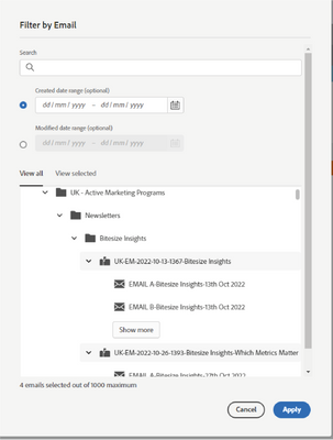
In the new interface for email performance report setup, the selector/filter for emails has poor contrast against a white background (as in the image below). Can I suggest making the contrast of the highlighted/selected emails starker, so visually impaired users can navigate this with more ease?
849
1 Comment
You must be a registered user to add a comment. If you've already registered, sign in. Otherwise, register and sign in.
- Copyright © 2025 Adobe. All rights reserved.
- Privacy
- Community Guidelines
- Terms of use
- Do not sell my personal information
Adchoices

.png)