- Marketing Nation
- :
- Products
- :
- Product Discussions
- :
- Equal Height
Equal Height
- Subscribe to RSS Feed
- Mark Topic as New
- Mark Topic as Read
- Float this Topic for Current User
- Bookmark
- Subscribe
- Printer Friendly Page
- Mark as New
- Bookmark
- Subscribe
- Mute
- Subscribe to RSS Feed
- Permalink
- Report Inappropriate Content
Hi there,
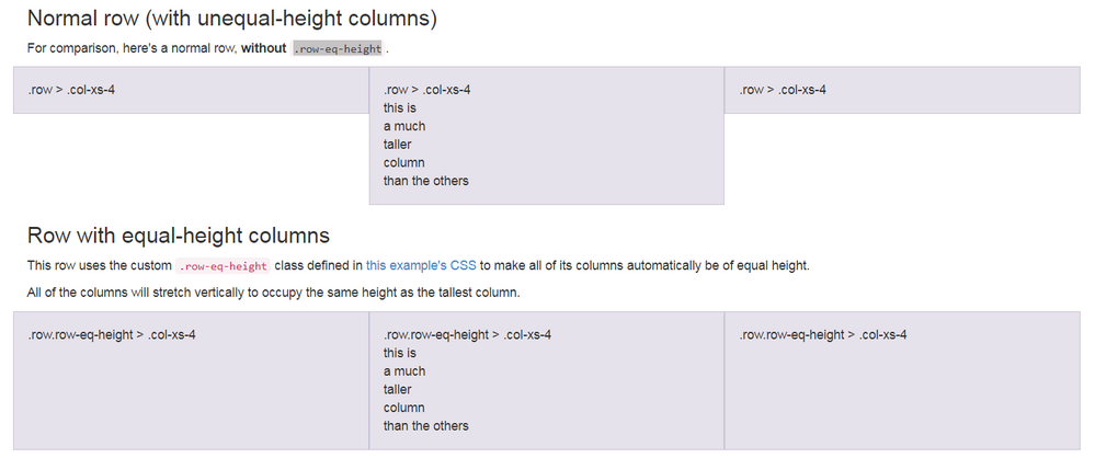
Does anyone here have sure-shot ways to make columns equal heights within landing pages? We're using bootstrap for our pages, and I tried using the flex property but something isn't functioning properly. I tried a few other methods as well but none of them appear to be working.
The top part of this image is where I'm at with my LP. I'm trying to achieve the bottom portion.
Any insight would be greatly appreciated. Here's what I'm working with so far. Open to utilizing methods outside of bootstrap as well.
Here's my sample page
https://info.chargepoint.com/Offer-LP---Tiles.html
The CSS I'm using
.box { display: -webkit-flex; display: -ms-flexbox; display: flex; overflow: hidden; } .box .column { flex: 1; }
Here's the HTML
<div class="webContainer box"> <div class="row"> <div class="col-sm-3 webElement column"> <div id="webImg1" class="mktoText webCopy" mktoName="webinar1"> <img class="img-responsive webImg" src="https://info.chargepoint.com/rs/079-WYC-990/images/720x500_Placeholder.jpg" /> <p class="webText">This will be content for webinar 1. Here is more stuff to put in and see how it looks with a full paragraph. Hopefully this is good.</p> </div> </div> <div class="col-sm-3 webElement column"> <div id="webImg2" class="mktoText webCopy" mktoName="webinar2"> <img class="img-responsive webImg" src="https://info.chargepoint.com/rs/079-WYC-990/images/720x500_Placeholder.jpg" /> <p class="webText">This will be content for webinar 1. Here is more stuff to put in and see how it looks with a full paragraph. Hopefully this is good.</p> </div> </div> <div class="col-sm-3 webElement column"> <div id="webImg3" class="mktoText webCopy" mktoName="webinar3"> <img class="img-responsive webImg" src="https://info.chargepoint.com/rs/079-WYC-990/images/720x500_Placeholder.jpg" /> <p class="webText">This will be content for webinar 1. Here is more stuff to put in and see how it looks with a full paragraph. Hopefully this is good.</p> </div> </div> <div class="col-sm-3 webElement column"> <div id="webImg4" class="mktoText webCopy" mktoName="webinar4"> <img class="img-responsive webImg" src="https://info.chargepoint.com/rs/079-WYC-990/images/720x500_Placeholder.jpg" /> <p class="webText">This will be content for webinar 1. Here is more stuff to put in and see how it looks with a full paragraph. Hopefully this is good.</p> </div> </div> </div> </div>
f
https://info.chargepoint.com/Offer-LP---Tiles.html
fffffffffffff
Solved! Go to Solution.
Accepted Solutions
- Mark as New
- Bookmark
- Subscribe
- Mute
- Subscribe to RSS Feed
- Permalink
- Report Inappropriate Content
Im not aware of any limitations that you'd have to consider when setting up Bootstrap with Marketo -- it'll do just about anything you can do anywhere else on the front-end.
I normally follow a kind of simple rule of thumb to keep my code "layered": I'll separate the architectural components (rows/columns) into one "layer" and add my Marketo editable areas as a child <div> inside of those containers. This makes it a little easier to handle the layout independently from the content sections.
I used pre-flex Bootstrap for a while and it took a little getting used to in making the transition to 4.x but it's only made things easier and more flexible than before. If you dig a bit thru their docs, there's all kinds of new syntax -- like "p-3" for "padding 3 units, all the way around" and "py-3" for "padding 3 units on the y-axis" .... -- that make it easier to adjust the layout with classes instead of inline styles.
I've setup a "playground" here: [GS] // FLEX Template to demo some of the basic and advanced features of our FLEX LP framework, it might be useful for some inspiration. Some of my favorite applications of BS4 + Marketo are using the toggles to re-arrange the content blocks.
You can tap into the "order" attribute to move things up/down in the layout.
You can use the "flex-grow" attribute to resize columns -- and the columns are easier to work with b/c they'll resize if you hide one of them (using something like <div class="col-12 col-md">....</div> for a column (at the md- breakpoint, the layout will be even columns, for mobile the cols will be full-width). Adding the flex-grow property to these columns lets you resize them in proportion (i.e. 1:2 (33/66) or 1:4 (20/80)).
- Mark as New
- Bookmark
- Subscribe
- Mute
- Subscribe to RSS Feed
- Permalink
- Report Inappropriate Content
Re: Equal Height
Check out card groups and card decks, they both are native solutions for equal height columns. https://getbootstrap.com/docs/4.0/components/card/#card-layout
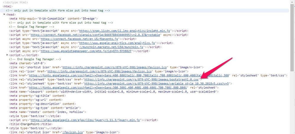
I tried to fiddle around a little in the inspector and it looks like you might need to update your version of bootstrap. The file that is getting loaded is labeled "Bootstrap v1" so it may be that you're working with an outdated version (so the docs wouldn't work until you update). You can find a really easy copy/paste set of CSS and JS to get started with the latest version here: https://getbootstrap.com/docs/4.0/getting-started/introduction/
In the inspector, I tried to use the class "d-flex" (display:flex;) on some of the elements and I didn't see it populate the CSS for that class in the inspector, so Im guessing at very least you're not running Bootstrap 4 which is the version where you can really take advantage of the flex display for equal height columns.
Let me know if you've got questions on updating Bootstrap, or getting something from the documentation on the cards in play.
- Mark as New
- Bookmark
- Subscribe
- Mute
- Subscribe to RSS Feed
- Permalink
- Report Inappropriate Content
Re: Equal Height
Thanks for the suggestions. I think I will start from scratch on this new template I'm using and utilize Bootstrap 4.0. Have you ever had luck with the flex properties in Marketo landing pages? I was wondering if there might be a limitation of some sort that is stripping away potential code necessary for flex. I've been discovering some strange behaviors as I refresh our companies landing pages.
Thanks again, Dave. Your insights are always very much appreciated.
- Mark as New
- Bookmark
- Subscribe
- Mute
- Subscribe to RSS Feed
- Permalink
- Report Inappropriate Content
Im not aware of any limitations that you'd have to consider when setting up Bootstrap with Marketo -- it'll do just about anything you can do anywhere else on the front-end.
I normally follow a kind of simple rule of thumb to keep my code "layered": I'll separate the architectural components (rows/columns) into one "layer" and add my Marketo editable areas as a child <div> inside of those containers. This makes it a little easier to handle the layout independently from the content sections.
I used pre-flex Bootstrap for a while and it took a little getting used to in making the transition to 4.x but it's only made things easier and more flexible than before. If you dig a bit thru their docs, there's all kinds of new syntax -- like "p-3" for "padding 3 units, all the way around" and "py-3" for "padding 3 units on the y-axis" .... -- that make it easier to adjust the layout with classes instead of inline styles.
I've setup a "playground" here: [GS] // FLEX Template to demo some of the basic and advanced features of our FLEX LP framework, it might be useful for some inspiration. Some of my favorite applications of BS4 + Marketo are using the toggles to re-arrange the content blocks.
You can tap into the "order" attribute to move things up/down in the layout.
You can use the "flex-grow" attribute to resize columns -- and the columns are easier to work with b/c they'll resize if you hide one of them (using something like <div class="col-12 col-md">....</div> for a column (at the md- breakpoint, the layout will be even columns, for mobile the cols will be full-width). Adding the flex-grow property to these columns lets you resize them in proportion (i.e. 1:2 (33/66) or 1:4 (20/80)).


.png)